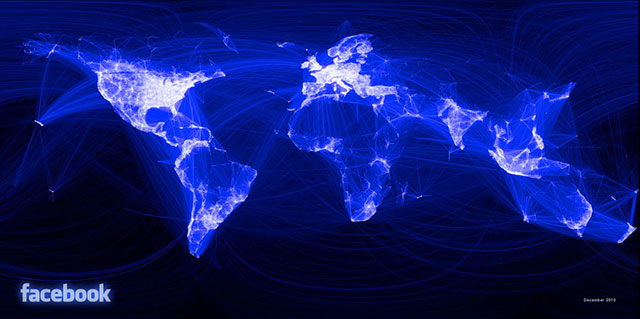
The World According to Facebook
Paul Butler, an intern at Facebook put together this data visualisation map of Facebook friendship locality relationships around the world. The glaring black hole of China is due to Facebook being completely blocked there, whereas people in Russia and Brazil prefer other social networking sites, and Africa presumably is dark as a result of relatively low internet usage.
In his own words:
“Visualizing data is like photography. Instead of starting with a blank canvas, you manipulate the lens used to present the data from a certain angle… When the data is the social graph of 500 million people, there are a lot of lenses through which you can view it. One that piqued my curiosity was the locality of friendship. I was interested in seeing how geography and political borders affected where people lived relative to their friends. I wanted a visualization that would show which cities had a lot of friendships between them.”
For more info on exactly what he did and how (and source). Via.


No Comments so far
Leave a comment
Leave a comment
Line and paragraph breaks automatic, e-mail address never displayed, HTML allowed:
<a href="" title=""> <abbr title=""> <acronym title=""> <b> <blockquote cite=""> <cite> <code> <del datetime=""> <em> <i> <q cite=""> <s> <strike> <strong>