urbanism – landscape – ideas – theory – whimsy

Toronto From the Perspective of Flickr and Twitter

Toronto from the perspective of Flickr and Twitter: Red dots are locations of Flickr pictures. Blue dots are locations of Twitter tweets. White dots are locations that have been posted to both (image: Eric Fischer at Flickr.com). Move over with mouse to see Google Map overlay to locate yourself.

An interesting (and beautiful) set of maps have been made by Flickr user Eric Fischer showing maps of the locations of Flickr photos and Twitter activity in major urban centres around the world (see the full set called “See something or say something” to compare to other cities). What’s interesting is how clearly the downtown street fabric of Toronto (and other cities) is revealed by people’s photos and tweets. While it might seem obvious that the streets (being our main public realm) are the places where the most concentrated activity of this kind takes place, it still suggests things about how people use the city and of what and where they choose to take photos. Outside the core, the main photo concentrations appear to be the waterfront and major parks, with a few splotches at major urban nodes which suggests a large preference for taking photos of the natural environment. Meanwhile the Twitter activity is much more evenly spread across the city, although still concentrated enough around the major streets of the city to give a suggestion of the street network. The clarity with which Yonge St, Bloor/Danforth and Queen St stand out shows just how much activity in general in Toronto is concentrated around these three streets that most of us know are the main spines of the city. If only Queen St had a subway line recognizing this to match the other two!

Image 01

The Subway to Nowhere?

Vaughan north of highway 407 (source: google maps)

The Spadina subway extension to Vaughan is under construction and scheduled to be open for the end of 2015, but where exactly is this thing going? Sure it goes to York University (which I think most people would accept is a good idea), but there will be a full 2 more stations north of Steeles Ave into Vaughan, so what exactly is up there? See above… Oh dear… It looks like we’re extending a subway line that originally kind of went to nowhere, to another even more extreme nowhere, a vast sea of single-storey warehousing, manufacturing, big box stores and railway lands. But wait! Building a subway will result in massive development right? So this area is ripe for a total makeover, right? Oh wait a minute… here’s the famed subway-driven development along the Yonge St corridor north of highway 401 from Sheppard Ave to north of Finch at the same scale, the result of almost 40 years of development (see below).

Yonge St development corridor north of highway 401 at the same scale (source: google maps)

I guess the even more modest kind of development around the Sheppard Line wouldn’t have much of an effect either (see below).

Sheppard Ave development corridor north of highway 401 at the same scale (source: google maps)

So just how large is this sea of nothingness that we’ve sent a subway line to? Oh, that’s right, as large as the entire downtown core of Toronto (see below). Damn.

Downtown Toronto from the Union Station to Bloor at the same scale (source: google maps)

Shanghai’s Metro and London’s Tube Head to Head

Shanghai Metro Network 2020

Shanghai Metro Network in 2020 in style of the famous London Tube diagram, by Flickr user Kzaral

Now that Shanghai’s Metro is officially the longest subway network in the world (by track length), I thought it would be interesting to do a comparison between it and the long-time title holder that it displaced, London’s Underground.

The first major difference is that Shanghai’s Metro is still expanding, very fast. By 2020 it intends to have added over 350km in new lines and extensions, almost doubling its network length, and in China, when the government intends to achieve something within a 10 year timeframe, they generally succeed or come close. With currently 420km of network, Shanghai’s Metro earlier this year passed the Underground (which has 402km, although I believe that doesn’t include the Overground line or the Docklands Light Railway) after opening 3 new lines and long extensions to 2 other lines (creating a subway link between the city’s two airports) in time for the opening of the Shanghai Expo. The shocking thing about the 2020 expansion plan is that it will make the above diagram (created by Kzaral aka FML in the style of the famous Tube map) a reality and not a fantasy. All this from a system that only opened its first subway line (appropriately called Line 1) in 1995. Yes, you read that right, 1995.

The second major difference is that there is no suburban commuter rail system in Shanghai that compares with those in cities like London, Paris and Tokyo, where the railway network is essentially operated as a secondary rapid transit system with longer station intervals than the subway, generally with an interchangeable fare system. In Shanghai there is only the regular railway network which is not run anything like a metro rapid transit system, but clearly prioritizes long-distance and high-speed trains, and largely services only 2 stations within the inner city, the main station and the south station. This is a severe deficiency in a city as large as Shanghai since it is those suburban commuter rail systems that ensure quick and efficient travel into the city centre from the suburbs, and in Shanghai make no mistake, those suburbs are often nearly as high density as the inner city. This is the reason that even with what seems on the surface like a fully implemented subway system, Shanghai actually desperately needs to push ahead with the rest of the subway system expansion program, because most of the new lines and track length will be servicing the vast suburban areas in an attempt to make up for this lack of a commuter rail network. Time will tell whether this model actually services the suburbs with better all-round transit than the commuter rail approach, and at least Shanghai has the density to justify subways in the suburbs. However, as of now, the subway model predetermines extremely long subway rides from the suburbs rather than quicker commuter trains that stop less frequently and dump you in the city centre to jump on the subway to your destination. In contrast to the London commuter rail paradox of someone living in a rural village outside the city potentially having a significantly shorter commute than someone living in the inner city itself, in Shanghai the emerging paradox (fueled by extensive high-speed rail expansion) is someone living in a city 300km away from Shanghai (eg Nanjing) having a shorter commute than someone living in Shanghai’s suburbs (the new Shanghai-Nanjing train can do the 300km trip in 73 minutes).

Full current regional network diagram of Shanghai Metro, July 2010, move over with mouse to show 2020 expansion (credit: Shanghai Daily)

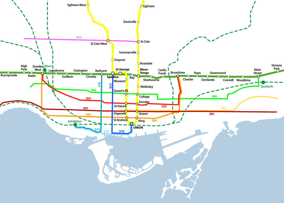
Full regional network diagram of London Underground (including Overground and Docklands Light railway) (credit: TfL)

The Shanghai network map is quite a bit less diagrammatic than the iconic Tube map, but a comparison reveals the different biases of each system. In particular, the primary strength of the London Underground has always been in movement around inner London’s central areas for which the coverage is excellent. This bias is highly demonstrated in the famous Beck Tube map in the extremely large size of Zones 1 and 2 compared to the suburban zones, although this was no doubt to allow clear reading of the closely spaced stations and line layouts. In Shanghai’s case the emphasis is clearly on the radial pattern of suburban lines rather than the central area, and this will only increase with the future expansion plans. In particular, notice in the two maps that Shanghai’s circular Line 4 (the purple irregular circle) and London’s Circle Line (yellow) appear about the same size in the two diagrams, but Line 4 encloses an area 3.6 times bigger than the Circle Line (62.9km2 vs 17.5km2, by my measurements).

Central area diagram of Shanghai Metro, July 2010, move over with mouse to show 2020 expansion (credit: Shanghai Daily)

Central area diagram of London Underground (including Overground and Docklands Light railway) (credit: TfL)

Now perhaps Shanghai’s central area is larger than London’s thus justifying a larger scale for the circular line, or perhaps Line 4 shouldn’t be used to compare either its function or service area with the Circle Line. Unfortunately, this is where the diagram maps start to fail us, because it becomes hard to understand whether there’s a significant difference in service quality or convenience as a result of this difference in scale. For that we need a geographically accurate representation of both systems that we can look at and measure at the same scale. So here we are:

Central area of Shanghai Metro, July 2010 (geographically accurate, showing historic city centre districts)

Central area of London Underground (geographically accurate, not including Overground and railway network), move over with mouse to show major parks of central London

What is most noticeable right away is that London’s Circle Line falls entirely inside the Underground’s Zone 1 which can easily be taken to represent central London, although anyone who knows London will know that quite a few districts considered “central” fall inside Zone 2 instead. Additionally, the London Congestion Zone (which could also easily by used as a boundary for central London) largely mimics Zone 1 with a few variations but enclosing an area of the same size. This means that the Circle Line directly services numerous important destinations right within central London, while it’s tracks are shared with 3 other lines over different parts of the route meaning every station on the Circle Line allows transfers to a different line. There are additionally 18 railway stations and termini within the Underground’s Zone 1, 6 of them directly serviced by the Circle Line, allowing direct connections for commuter rail passengers.

For the Shanghai map I have included historic districts of the city which include the Old Chinese City and its port district along the Huangpu River, the French Concession and the International Concession. Note how Line 4 essentially entirely runs outside the central historic districts. In fact the large Western District area of the International Settlement was the least developed part of all the historic districts, and remains a rather distant feeling part of the city. Strangely, Line 4 also avoids directly servicing Shanghai’s new financial centre at Lujiazui in Pudong on the east bank of the Huangpu River, although it does service Shanghai’s main railway station, although this station itself falls outside of the historic core of the city. The route of Line 4 seems to have largely been decided by the convenience of using old railway right-of-ways and the construction of Shanghai’s Inner Ring Road rather than determining what would best service the city’s future transportation needs.

In general, central Shanghai today is often considered to be anything within the Inner Ring Road, but this definition does not relate to the historic city in any way (particularly on the Pudong/eastern side), while functionally it might relate to the modern reality. I calculated that the old districts of Shanghai I included on the map above cover about 38km2 which funnily enough is around the same size as London Underground’s Zone 1, but nevertheless Line 4 is far bigger than these historic districts, and also misses other new centres at the edge of the historic districts such as Xujiahui and Lujiazui. The real implication of this comes when you examine numbers of stations: London’s Circle Line has 27 stations over 21km around the circle (all of them with an available interchange to at least one line, and many of them directly servicing major destinations), while Shanghai’s Line 4 has 26 stations over 33.7km with interchanges at 16 stations and servicing relatively few major destinations. All together there are 64 Underground stations in London’s Zone 1, but only 34 within Shanghai’s Line 4 (not including Line 4 stations themselves, since I consider them to be outside the city centre), even though London’s Zone 1 (at 38km2) is almost half the size of the area inside Line 4 (62.9km2).

Full current regional network of Shanghai Metro, July 2010 (geographically accurate)

Full regional network of London Underground (geographically accurate, not including Overground and commuter railway network)

Now of course in terms of urbanism, Shanghai and London are very difficult cities to compare, so it may not be fair to dismiss the route of Shanghai’s Line 4 as inappropriate and inconvenient compared to London’s Circle Line. It’s certainly true that central Shanghai is not and will not be served as well by its Metro as central London is by the Underground, but in many ways this reflects the evolving functional reality of Shanghai and the decreasing importance of the historic districts in the future development of the city, largely resulting from the budding desire to protect the historic heritage in the inner districts. But given the densities of suburban Shanghai and the far lower car ownership rates and the lack of commuter rail options, Shanghai does desperately need to improve transportation in the suburbs, since in the future Shanghai’s suburbs cannot be allowed to rely on automobile transportation to the same degree as London or other western cities because at these densities, congestion will be unavoidable and nightmarish. If you look at the entire cities’ networks in a geographically accurate representation (see above), the systems are actually highly comparable, and the area covered also comparable, with the caveat that without showing London’s commuter railway network, London’s Underground appears to have less coverage than Shanghai’s current system (particularly south of the Thames which has always been poorly serviced by the Underground itself but is quite well served by railway). Perhaps the most shocking thing is that London has been benefiting from Underground services since 1863, which given the massive population and size of Shanghai, makes you wonder how on earth Shanghai functioned at all before the first subway line opened in 1995!

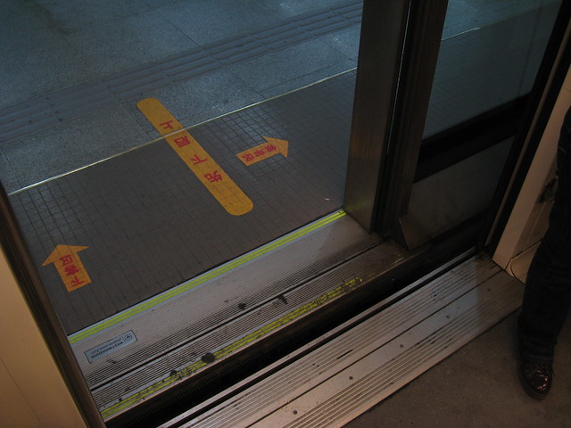
Lastly, there are a few things Shanghai could do to help improve the Metro beyond the constant expansions. It’s very odd that none of the lines (even the most popular, Lines 1 and 2) operate much beyond 11pm, and in fact many of the lines cannot be relied upon after 9pm or 10pm (although for some of them, running has been extended during the Expo). Additionally the station dwell times seem excessively long compared to most systems I’ve used in the world – the slow speed of the train arrival, the delay until the doors are opened, the delay before the train leaves after the doors have closed, all add time at every station, which compounds itself on longer rides. I don’t know if the introduction of automatic train operation will be able to speed up these times or whether they relate to safety concerns with the sliding glass platform barrier doors at most stations. Lastly, crowding on trains even during off-peak times and late in the evening seems to indicate that Shanghai’s Metro should increase operating frequency on many of its lines, and suggests that there is clearly high demand for later, more frequent subway operation.

Credits: The Underground geographically accurate maps are based on the work of London Underground geographic maps group at Wikimedia Commons – station locations are accurate, but line routes between stations have been interpolated.

Image 01Image 01Image 01Image 01Image 01

Subway platform barriers, the quick and easy way

A train sitting at Shanghai Science & Technology Museum station platforms on Shanghai's Metro Line 2

New half-height metal and glass platform barriers along Shanghai Metro’s Line 2 (green line) station platforms prove that you can improve subway station safety without the expense and complications of the full height sliding glass platform doors. What’s even more impressive (if you think about the TTC’s insistence that any form of platform barrier can’t be done without an automatic train driving system) is that these trains are still being manually driven. Admittedly, the trains tend to enter the station quite a bit more slowly than the TTC’s subway trains, and getting the alignment quite right manually probably slows down operation a little bit, but apart from that the simplicity and elegance of this solution is quite remarkable. Even though gaps to the track still exist, the feeling of security on the platforms is greatly improved by this solution and you can lean against the barriers comfortably and safely even while a train is entering the station.

Century Avenue station platforms on Shanghai's Metro Line 2

However, at People’s Square (see below, by far the busiest station on the Shanghai Metro network), because of the crowds always present on the platforms, they opted for half-height sliding glass platform doors which even more effectively address the safety issues, presumably at considerably less expense than the full height doors, and again alignment of the train does not seem to be a significant problem. The only limitations of this half-height solution is the difficulty of providing heating and/or airconditioning in the platform areas.

Line 2 platforms at People's Square interchange station on Shanghai's Metro during a typical rush hour - the doors have just closed and these are the people who couldn't fit in to the train, waiting for the next one

And of course, even on Shanghai Metro Line 1 (red line, which has full height glass sliding platform doors) they don’t always get the alignment quite right, and will occasionally back up a little, or just open the doors slightly misaligned (see below, where the yellow arrow pointing out from the door is at the centre of the platform doors).

400_8289

Misaligned train doors with platform doors at Shaanxi Nan Lu station on Shanghai Metro Line 1

Mysterious new bike share program in Shanghai

A new bike sharing program has been set up in Shanghai’s former French Concession by Xuhui District’s Tourism Bureau just in time for the Expo, with bicycles and infrastructure provided by Shanghai’s own Forever bicycle company. Unlike other such systems already existing around Shanghai (such as in Minhang District, Baoshan, Pudong and Hangzhou)  it’s apparently aimed at tourists rather than residents. The system supposedly has under 200 bicycles and 7 bike rental points which operate 24 hours a day, and the bikes are tagged with RFIDs so they can be tracked. However, there are only 2 locations where you can buy the cards needed to use the bikes, and then only during business hours, and there is no signage or information whatsoever at the rental points about how to use the system or where you need to go to start using the system. At the above rental point on Wukang Lu, even though one of the administration locations is mere steps away, no signage in chinese or english indicated that. It is a truly mysterious system. Anyways, 300rmb (c. CAD$50) deposit is required plus minimum 100rmb loaded onto card, and then it’s 2rmb (CAD 0.30) for the first hour of a rental and 4rmb for each hour after that, and you can get the card at 393 A Wukang Lu (inside Xuhui Tourist Information Center) or 1068 ZhaoJiaBang Lu or check out the official website (chinese only).

Shanghai’s metro during rush hour

Three videos to show the kind of crowd volumes that Shanghai’s People’s Square metro station (interchange for lines 1, 2 and 8 ) experiences during a typical rush hour – the unending sea of people is slightly mind-boggling, but by keeping with the flow an enormous number of people can peacefully get from A to B (the story on the platforms when the train doors open is a lot less peaceful). Click on the HD button to get higher quality video when viewing fullscreen.

Trains, Taxis, Rickshaws and Tuktuks…

A Valentine’s Day trip to Suzhou for a cherry blossom festival (yes cherry blossoms were out on February 14th!) – it was an exercise in trains, taxis, rickshaws and tuktuks that started off with a subway trip to Shanghai Railway Station to catch the bullet train to Suzhou (train tickets cost 26RMB / US$3.75 each way):

400_7794

Bullet train from Shanghai Railway Station to Suzhou, about 40 minutes - these trains are 16 cars long and are essentially 2 trains coupled together - this is the joint between the two trains

  • Taxi trip from Suzhou Railway Station west towards Lake Tai and the “Taihu Garden Court” – trip time circa 1hr (under 100RMB / US$15
400_7893

Why travel by 4 wheels when you can travel by 3? The one we took was an older model in much worse shape than this one

  • We took one of these 3 wheeled cars a few minutes ride into the local town centre to the bus station (cost: 5RMB / US$0.75)
400_7889

Ohoh... we have to get on this bus to get back to Suzhou (maybe 1.5hr ride!)... to shove or not to shove that is the question!

  • This bus will take us back into Suzhou, but there’s a lot of people waiting; the first one is full and we can’t get on; we get on the second, but it’s pretty full and we have to stand – trip time is estimated at 1.5 hours, but after what seems like an hour and only half way there, we get off to have lunch in a district centre in the suburbs of Suzhou
  • Taxi back into Suzhou (we ask the driver to take us to Suzhou, and he says, “this is Suzhou!”) (cost: circa 50RMB / US$7.50)
400_7915

Arriving by tricycle rickshaw at the main entrance of the exquisite Garden of Cultivation (Yipu Yuan) at 5 Wenya Lane in the NW corner of Suzhou's old city

  • From outside the canal that circles the old city of Suzhou, we grabbed these tricycle rickshaws through the narrow lanes of the old city to the Garden of Cultivation (cost: 20RMB / US$3)
400_8004

Motorcycle richshaw/tuktuk back to the train station, four of us hanging on for dear life as we hustle through some of Suzhou's tiny streets taking a shortcut

  • To get back to the railway station for the trip home, four of us piled in to this 3 wheeled motorcycle rickshaw/tuktuk (cost: maybe 5RMB / US$0.75?)

Note: the photos are geotagged in Flickr so you can track the trip, however Flickr uses yahoo maps whose China mapping and airphoto coverage is very poor at the moment

Growth of Toronto’s Subway

ttc-subway_rc_4.gif

We prepared this map of the evolution of the TTC subway system in response to a challenge over at spacingtoronto – while this version didn’t get shortlisted as a finalist, check out the great maps that did.

One thing I prefer in our map is that the subway lines are shown true to scale, so you can compare the real lengths that have been added over time and gauge how much of the city was being covered by each phase.

Check out a larger version of our map, where you can make out station names.

Also see our reimagining of the TTC transit map from October 2006.

Spadina Subway Extension Clears Funding Hurdle

The Toronto Star is announcing on its front page that a final $697 million from the federal government has sealed the Spadina Subway Extension deal (see their article here). The money comes as part of a large package of funding for transit in the GTA including:

A Mississauga transitway, a bus-only road along Highway 403 and Eastgate Parkway from Burnhamthorpe Rd. to Eglinton Ave. E.

Brampton’s $280-million Acceleride project, meant to speed bus service. Ontario has already committed $95 million for the improvements.

An expansion of York Region’s Viva bus system. York Region officials want to get buses on to dedicated lanes.

The widening of Highway 7, in the amount of $55 million.

An environmental assessment to extend Highway 407 eastward to link up with Highway 401. This would go through federal Finance Minister Jim Flaherty’s Whitby-Oshawa riding.

A $5 million study of rapid transit in Durham.

For those unfamiliar with the $2 billion Spadina Extension proposal, it continues the Spadina subway line north to York University, then beyond Toronto’s boundary at Steeles to connect to (the future) Vaughan Corporate Centre at Highway 7 in Vaughan. I include a map below from the TTC’s website on the matter – more information can be had here.

preferaligapril_e.jpg

Toronto Transit Map Reimagined

ttc-map-rc3_crop_detail-e-sm2.png

Somewhere someone was asking for someone to come up with a reimagined transit map for Toronto (could it have been Reading Toronto here?), so I thought I’d give it a shot. The one Graeme Stewart posted at Reading Toronto is interesting but I find it too schematic-looking. At the GTA level, scale is grossly distorted, but on the downtown detail map I love how he managed to integrate neighbourhood names into the map. Fantastic.

Part of his point was that more of the system should be shown than just the subway – the GO lines and the streetcars should be shown to represent more of the true nature of the “system” and I think I support his idea. However there are certain caveats and problems:

  1. Apart from supposed “dedicated right-of-way” LRT streetcar lines (such as Spadina’s 510 line and the Queen’s Quay lines and the western portion of the Queen 501 route along the Queensway), streetcar lines in Toronto are having serious problems moving swiftly through the city. One hears complaints of people being able to walk faster than the Queen cars move through traffic. Even the dedicated right-of-way lines have issues – a report I read indicated that the Spadina car on average is slower at getting its passengers down to Queen than the old pre-1997 buses were – I also have friends who live out near Mimico for whom in most cases taking the subway and getting a bus is quicker than the 501 car. This does beg the question of whether they should be included when some frequent service time-efficient bus routes are not.
  2. On Stewart’s GTA map (here), GO Transit’s rail network is given heavy prominence next to the subway lines. Indeed on GO’s own system map, their train network is given heavy coloured-line subway-like prominence, with the bus network as more generic thinner green lines. I flirted with this idea, but for now have settled for a more toned-back approach to the GO network for the simple reason that until higher frequencies are achieved and more serious urban centre-type development occurs around GO stations, the system currently bears little resemblance (in reality) to an LRT, BRT (Bus Rapid Transit), or subway system since it is heavily skewed towards commuter traffic alone.
  3. VIVA is here – York Region’s BRT transit offering is up-and-running (for a year now), and should be given heavier priority at the regional scale. I dream of a day when an integrated fare-structure allows simple and straightforward use of all these systems together with full transfer privileges and no complications – perhaps trying to envision what the system even looks like as a whole is the first step? For now I have only shown full-service routes of VIVA, not peak-only. I don’t actually even know whether any of the other GTA municipalities have BRT-equivalent frequent-service routes to add – if they have, I haven’t heard of them.

I am also working on a full GTA level map showing all GO lines to their ends. All of these maps are real-scale without distortions in space – the disadvantages are that at smaller sizes, things become harder to read and distinguish. It could be that after I’ve done these, then a simpler diagram version could be done that distorted distance as most existing transit maps do.

Style – I’ve tried to stick to the current TTC diagram style. Why? I kind of like it. I am from Toronto though. Others, such as Miguel Syyap’s quite wonderful TTC maps, have used London Underground’s famous style – which I must say looks good too! For some reason Syyap hasn’t shown an as-is system map using his style though. VIVA has adopted this same style for their diagrammatic system maps.

Here’s links to higher resolution versions of my map:

Toronto Transit Map – downtown detail

Toronto Transit Map – Metro +

Let me know what you think – any suggestions?

ttc-map-rc3_crop-e-sm.png

Also see our evolution of the TTC subway animated map from September 2007.