urbanism – landscape – ideas – theory – whimsy

Analyzing Urban Form by Block Shape and Size

The block pattern of Paris in map form and arranged by shape and size

French artist Armelle Caron has created a series called “tout bien rangé” in which the block patterns of various cities have been disassembled, sorted by shape and size and rearranged as a new graphic representation of the city. While the result of the taxonomicalish classification and reorganization is not particularly useful from an urban design perspective (the city maps don’t seem to be at the same scale, for one), it’s certainly an interesting way to look at the city, and to think about blocks, block size and block shape, which are such an integral and enduring element of our cities’ urban forms. See all of the pieces on the artist’s site. (via Strange Maps)

For something similar see The Patterns of the Urban Fabric of Beijing’s Hutong.

The block pattern of New York (part of Manhattan and part of Brooklyn) in map form and arranged by shape and size


The block pattern of central Berlin in map form and arranged by shape and size

Toronto From the Perspective of Flickr and Twitter

Toronto from the perspective of Flickr and Twitter: Red dots are locations of Flickr pictures. Blue dots are locations of Twitter tweets. White dots are locations that have been posted to both (image: Eric Fischer at Flickr.com). Move over with mouse to see Google Map overlay to locate yourself.

An interesting (and beautiful) set of maps have been made by Flickr user Eric Fischer showing maps of the locations of Flickr photos and Twitter activity in major urban centres around the world (see the full set called “See something or say something” to compare to other cities). What’s interesting is how clearly the downtown street fabric of Toronto (and other cities) is revealed by people’s photos and tweets. While it might seem obvious that the streets (being our main public realm) are the places where the most concentrated activity of this kind takes place, it still suggests things about how people use the city and of what and where they choose to take photos. Outside the core, the main photo concentrations appear to be the waterfront and major parks, with a few splotches at major urban nodes which suggests a large preference for taking photos of the natural environment. Meanwhile the Twitter activity is much more evenly spread across the city, although still concentrated enough around the major streets of the city to give a suggestion of the street network. The clarity with which Yonge St, Bloor/Danforth and Queen St stand out shows just how much activity in general in Toronto is concentrated around these three streets that most of us know are the main spines of the city. If only Queen St had a subway line recognizing this to match the other two!

Image 01

Beautiful Urban Moments – Part X

403_1090296

Beautiful flower murals on telephone utility boxes along the north side of Yorkville Ave, east of Hazelton Ave in front of Teatro Verde, Yorkville, Toronto

This is a great example of the creative potential of a simple solution to vastly improve the aesthetics of one of the typically ugly pieces of urban infrastructure, the telephone utility box. While land-line telephones may be on the way out, there’s still plenty of urban infrastructure that could similarly benefit from some creative attention. The mural is by Bruni Nielsen and is in Yorkville, Toronto along the north side of Yorkville Ave, east of Hazelton Ave in front of Teatro Verde.

Subway platform barriers, the quick and easy way

A train sitting at Shanghai Science & Technology Museum station platforms on Shanghai's Metro Line 2

New half-height metal and glass platform barriers along Shanghai Metro’s Line 2 (green line) station platforms prove that you can improve subway station safety without the expense and complications of the full height sliding glass platform doors. What’s even more impressive (if you think about the TTC’s insistence that any form of platform barrier can’t be done without an automatic train driving system) is that these trains are still being manually driven. Admittedly, the trains tend to enter the station quite a bit more slowly than the TTC’s subway trains, and getting the alignment quite right manually probably slows down operation a little bit, but apart from that the simplicity and elegance of this solution is quite remarkable. Even though gaps to the track still exist, the feeling of security on the platforms is greatly improved by this solution and you can lean against the barriers comfortably and safely even while a train is entering the station.

Century Avenue station platforms on Shanghai's Metro Line 2

However, at People’s Square (see below, by far the busiest station on the Shanghai Metro network), because of the crowds always present on the platforms, they opted for half-height sliding glass platform doors which even more effectively address the safety issues, presumably at considerably less expense than the full height doors, and again alignment of the train does not seem to be a significant problem. The only limitations of this half-height solution is the difficulty of providing heating and/or airconditioning in the platform areas.

Line 2 platforms at People's Square interchange station on Shanghai's Metro during a typical rush hour - the doors have just closed and these are the people who couldn't fit in to the train, waiting for the next one

And of course, even on Shanghai Metro Line 1 (red line, which has full height glass sliding platform doors) they don’t always get the alignment quite right, and will occasionally back up a little, or just open the doors slightly misaligned (see below, where the yellow arrow pointing out from the door is at the centre of the platform doors).

400_8289

Misaligned train doors with platform doors at Shaanxi Nan Lu station on Shanghai Metro Line 1

Champs-Élysées goes green, literally

Photo: Xavier Defaix for Nature Capitale (via Flickr)

The Avenue des Champs-Élysées was recently temporarily turned into a green oasis for a weekend for Nature Capitale, a gigantic art installation by “street artist” Gad Weil (who also turned the Champs into a huge field of wheat 20 years ago) and the visual artist and landscape artist Laurence Medioni with the help of agricultural and forestry professionals which was created as part of a protest by young French farmers angry at their increasingly difficult economic situation beset by falling incomes. It is an attempt to reconnect Parisians with the countryside and includes 150,000 plants covering more than 3 hectares of the avenue, as well as sheep, pigs and cows held in pens.

This brings to mind the temporary turfing over of Trafalgar Square in London I posted about in 2007 but is so much bigger and way more impressive.

Photo: fabiengelle on Flickr

Compare this to a normal day on the Champs (below), and you have to wonder why it shouldn’t be a green oasis every day!

Photo: Champs-Elysees on a normal day (from Daily Mail)

Evolutionary Space in the Junction

August 2008 - Band shelter and (temporary?) public space

An interesting evolutionary space has been created in the Junction on a vacant lot where some retail buildings were demolished in 2007. The empty site (which was originally being advertised as a “New Retail Development Build-to-Suit Opportunity”) was rehabilitated as an outdoor stage venue (the “Junction Train Platform”) as part of the centennial celebrations commemorating 100 years since the former City of West Toronto was incorporated. The (I think temporary) space has been outfitted with some seating and temporary plant material and seems to be a pretty popular place for people to relax and have a conversation. Behind the potted evergreens at the back I think are some parking spots. It’s a great use of what was essentially a barren, desolate gap in the urban fabric! More on the City of West Toronto Centennial celebrations, West Toronto Junction Historical Society and The Junction BIA.

August 2007 - "New Retail Development Build-to-Suit Opportunity"

March 2007 - Buildings in process of being demolished

The Unseen Ballet of Britain

A BBC television series called Britain From Above will be using GPS “satellite tracking and groundbreaking computer imaging” so we can “watch for the first time on television the great migrations across our landscape” that is the “unseen ballet of Britain”. This video teaser includes tracking the routes of shipping in the English Channel, taxicabs in London, tracking aircraft movements and telecommunications traffic!

Awesome!

A slightly better quality version of same video is available on the BBC’s site.

Free Wireless for the Waterfront Please

Free Wifi Zone in Montreal's Old Port

Map: Free Wifi Zone in Montreal's Old Port

I hope WaterfronToronto is paying attention – here’s a map of the free wifi zone (via sponsors) at the waterfront in Montreal’s Old Port (source). The zone was set up for and is under the jurisdiction of Les Quais du Vieux-Port (The Quays of the Old Port) – a 47.3-hectare (117-acre) territory with 2.7 kilometres of St Lawrence River waterfront – which is itself an entity created and managed by the federal agency in control of the entire Old Port, Société du Vieux-Port de Montréal (Old Port of Montreal Corporation).

Photo: Panorama of Montreal's Old Port

Photo: Panorama of Montreal's Old Port

Apparently Telus is the sponsor responsible for providing the actual wifi service, with other sponsors covering the costs. While some of us might prefer that something like Wireless Toronto (a volunteer-run not-for-profit community group dedicated to setting up free wifi hotspots around the city) were the one’s running something like this, the size of Montreal’s wifi zone would probably be too infrastructurally complicated and expensive for a small group like Wireless Toronto. Wireless Toronto have set up one of their hotspots at York Quay at Harbourfront Centre, though it’s fairly geographically limited. One of the most interesting aspects of Montreal’s zone is how the two marina areas are deliberately included allowing wifi access from moored boats! Toronto Hydro’s One Zone wireless network (which covers most of the downtown area) is not free and does not currently cover any part of the waterfront, and I think it’s the wrong model to pursue for the waterfront. I think free wifi on the waterfront would be a great way to encourage waterfront users of all kinds, and would be the kind of forward-looking optimistic project we really need to kick off the “idea” of the waterfront revitalization.

Old Port of Montreal from the air

Photo: Old Port of Montreal from the air

However, we should be a little careful when we look at the Montreal model – the Old Port area controlled by the Corporation is federal land, but being owned and operated by the Corporation actually means it is not technically public space. There are in fact a list of “site rules“, buskers and other entertainers are auditioned and require permits (as with many other tourist areas), leafletting and soliciting are not allowed, “activities may not be held or promoted on the site without permission” and “filming or photography for other than personal use must be authorized”. These are dangerous precedents for Toronto’s waterfront – while this post has mostly been about free wifi, I think the principle of freedom needs to additionally extend to the use of public space at the waterfront.

Gardiner to Come Tumbling Down… kind of

Parliament St & Waterfront Blvd

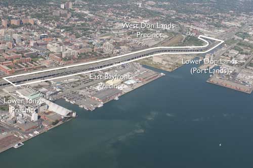
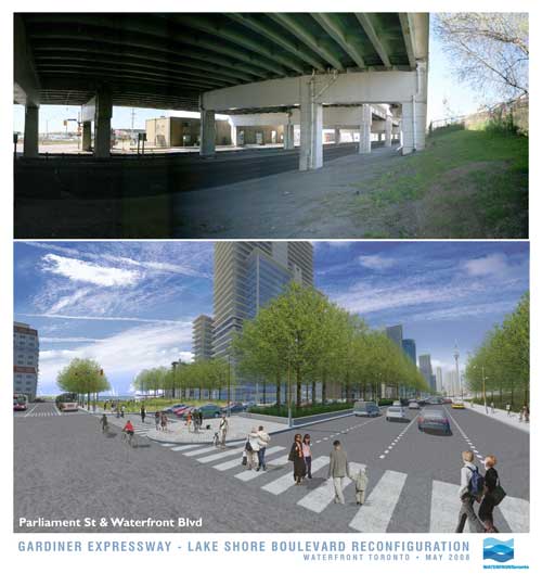
In an announcement with significant ramifications for the waterfront, the much-maligned Gardiner Expressway is to come tumbling down…. at least part of it. Waterfront Toronto, the City and the provincial Ministry of Public Infrastructure Renewal together appear to have stumbled into a momentous decision with the removal of funding for the Front St Extension and the (resulting?) decision to demolish the portion of the Gardiner from east of Jarvis to the Don Valley Parkway.

Lower Jarvis St & Waterfront Blvd

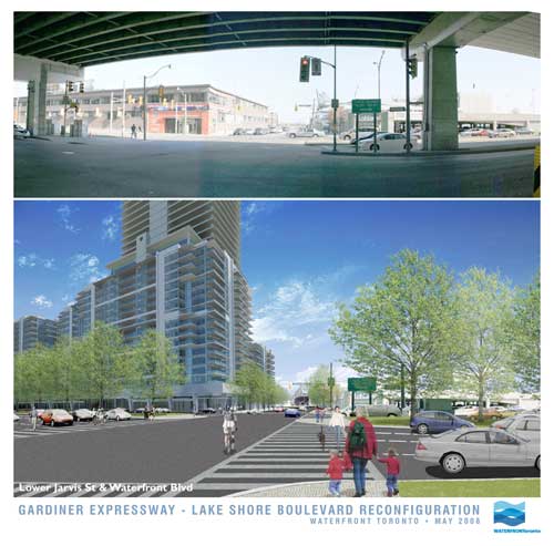
In these images released today, Waterfront Toronto gives us an idea of what the demolition of the Gardiner may mean at street level. And frankly, if this is the way it’s handled, it looks fantastic – with the added benefit (not shown in the renderings) that the railway corridor is not as wide by the time it gets to Jarvis, meaning there could be a window of hope for a relatively pleasant passage down to the lake for the East Side, all of a sudden making Waterfront Toronto’s proposed developments at West Don Lands, East Bayfront and in the future at the portlands, seem far more connected and potentially vibrant. Could this be a great day in the history of Toronto’s waterfront?

Hold your horses there…. I’m not so sure. While clearly this is a decision many of us have been gagging for for years (nay, decades!), in typical Toronto fashion are we bollocking up one of the most important decisions in the city’s planning history? While the renderings show a relatively tamed boulevard at grade (along the lines of University Avenue perhaps), the plan almost seems a slap in the face to the functionality of the Don Valley Parkway and the Gardiner combined. Now in a way it’s great that expressway functionality is not determining the decision making here, but this decision has huge ramifications on two very important roads that currently connect and essentially function as one road. While many will say “who cares”, what exactly are the expected traffic volumes on this at-grade road and how tamed and crossable will this really make it? I mean if it’s essentially a Gardiner at grade with a pedestrian signal every 5 minutes, I’m not so sure this is a good thing.

But apart from that, the mind-boggling, ridiculous, tear-you-hair-out frustration of this scheme is that if you’re making such a mess of the Gardiner and its “flow”, doesn’t it just make sense to demolish the whole damn thing while you’re at it (at least make it part of the plan to do so!)? Why on earth should the Gardiner remain above grade as it crosses the foot of Yonge Street, the most important damn street in the City and the Province, and come down at Jarvis? If you’re screwing up the Gardiner anyway, and the projected volumes are nice enough to cross at grade, then bring the whole damn thing to grade out at Strachan and open up Fort York to the lake, give City Place a chance to be an actual place, and dish out the benefits to the whole central waterfront while you’re at it.

But no. Just like Toronto to do something like this half-assed and (surprise, surprise) solely for the benefit of Waterfront Toronto’s proposed developments alone. Message delivered: central waterfront, go f**k yourself!

Area to be demolished

Bricoleur’s Habitat

redneckmansion2_500x334e.jpg

A friend sent a link to this photo entitled “Redneck Mansion”. There’s a certain genius to the way this has been done (and the colours are fantastic) – it could almost be a Bricoleur’s version of Moshe Safdie’s Habitat in Montreal (and would cost a hell of a lot less). The staircases are even reminiscent of Montreal’s exterior walkup duplexes/triplexes/multiplexes.

habitat-67-e.jpg

montreal-staircases.jpg

——————

Edit:

Unfortunately (I might say), it turns out that the intriguing caravan-sculpture masterpiece is an Amsterdam theatre set from 2005 designed by Catherina Scholten for a production of Checkov’s Ivanov. What a great idea for a theatre set! I say unfortunately because part of me dearly wished that some inspired bricoleur out there had actually dreamed up and executed such a wonderful habitat – alas no!

Here you can see some of the audience:

Photo: HetGelaat

The original photo posted was by Elmer Kroese.

Thanks to Space & Culture for linking to adaptivereuse.net‘s discovery of the true origin of the photo and work.