urbanism – landscape – ideas – theory – whimsy

Black Rock City

burning-man_overall1_400×410shkl.jpg

Black Rock City is the temporary city created each year to house the revelers at the 8 day Burning Man festival in the Black Rock Desert in Nevada.

From Wikipedia’s article on the subject:

“Much of the layout and general city infrastructure is constructed by Department of Public Works (DPW) volunteers…

“The developed part of the city is currently arranged as series of concentric streets in an arc composing, since 1999, two-thirds of a 1.5 mile (2.4 km) diameter circle… with the Man Sculpture and his supporting complex at the very center (40°45’56.88″N, 119°13’39.59″W in 2007). Radial streets, sometimes called Avenues, extend from the Man to the outermost circle…

“The innermost street is named the Esplanade, and the remaining streets are given names to coincide with the overall theme of the burn, and ordered in ways such as alphabetical order or stem to stern, to make them easier to recall. The radial streets are usually given a clock designation (for example, “6:00, 6:15”), in which the Man is at the center of the clock face and 12:00 is in the middle of the third of the arc lacking streets….

“Center Camp is located along the midline of Black Rock City, facing the Man at the 6:00 position on the Esplanade, and serves as a central meeting place for the entire city.”

The City is located in a slightly different location each year, and the festival itself upholds a policy of “leave no trace”. The 2007 edition of Burning Man brought together 47,097 people in an otherwise empty and desolate landscape.

Oblique (not from straight above) photos below are by Brad Templeton – plan photos are from GoogleMaps/Earth.

burning-man_overall2.jpg

burning-man_oblique-detail2.jpg

burning-man_oblique-detail1-sm.jpg

burning-man_oblique-detail1.jpg

burning-man_oblique-detail3.jpg

burning-man_oblique-detail5.jpg

burning-man_oblique-detail6.jpg

Yorkville – Beauty and the Beast

Photo (above): View east from parking garage along alley between Yorkville Ave and Cumberland St, in Yorkville west of Yonge, showing Metro Reference Library, rooftop patio of The Pilot (the Flight Deck) and other buildings in the Yonge-Bloor area, Toronto. Night view (below).

It’s that time of year again, when the TIFF turns Yorkville into a glitzier, crazier, and more bustling place than it already is. While moments of peace may be harder to find during the Festival, it’s worth reflecting for a moment on the heterogeneous beauty of the Yorkville area and how in some ways it represents the genius of Toronto’s urban character. While many people have been upset at the recent intense condo and hotel development in the area, a large number of the older, small-scale characterful buildings have so far survived, giving the neighbourhood one of the most interesting and diverse mixes of building type and building use in the city.

While the logic of density on a subway line might indicate that all of the low rise buildings that still line much of Yonge, Cumberland and Yorkville must inevitably give way to much taller building forms, I think it’s a mistake to deliberately cultivate this state of events since the character and charm of Yorkville revolves around its scale and that scale can easily be irrevocably lost through over-development, particularly if it happens during one, relatively brief building cycle.

On the other hand, I equally think it’s pointless to attempt to “freeze” a neighbourhood at one point in time, at a single density, existing uses, or existing building forms, since to do so is to in many ways prevent the area from evolving and, if done too early, would prevent an area from developing a mix of uses and building types and forms in the first place. It’s one of the trickiest balancing acts in urban design and planning, and so far Toronto has managed to walk this tight-rope in a relatively decent and humane way. Whether continuing with the same policies indefinitely will continue to deliver interesting mixed neighbourhoods like Yorkville is another question entirely, as is the different dynamic that develops when areas become extremely successful and overpriced, sometimes forcing radical changes to the urban fabric.

Photo (above): Tent erected for temporary club/dancehall for Toronto International Film Festival on future site of new Four Seasons Hotel at Bay St and Yorkville Ave. Night view (below).

The flip-side of the Yorkville story is the (beastly?) craziness of the TIFF, this year neatly exemplified by the temporary tent/club/dancehall erected in the parking lot behind the sales centre for the new Four Seasons hotel and condo development at Bay St and Yorkville Ave. How this club (whose entrance seems to be through the sales centre) is related to the hotel and condos is perplexing at this point, but it has made for an interesting addition to the streetscape and nightscape – particularly the eeriness of the blue-purple pulsating lights and deep base emanating from the transparent roof of a party that would normally be wholly invisible to the outside world.

McBride Cycle Building Vanishing Act


Photo: The McBride store at the beginning of demolition


Photo: The McBride store partway through demolition


Photo: The McBride vacant site after demolition

Demolition of the old McBride Cycle store on Dundas West east of Keele was completed earlier in the summer, after the family-run business, which had been serving the community for 97 years, went into receivership last year. Now real estate for sale signs have been erected on the site, yet there does not appear to be the usual development application notice we’ve become so used to.

It seems odd (dare I say ridiculous?) to demolish a building before trying to sell the site, but of course Toronto’s a city where having a building with any heritage value whatsoever is seen as a detriment to profitability. The original building was a very nicely scaled early 20th century commercial building, and at first glance it seems incredible that it wasn’t an easy candidate for quick conversion into lofts.

Gord Perks (the local councillor) wrote on his blog earlier this year that the building would be demolished and that a 74 unit condominium with retail/commercial at grade was being proposed – one now wonders (given the lack of a development application notice and presence of for sale signs) whether the original developer’s plans have been abandoned.

Now that the building has been demolished, it’s true that a relatively intense version of Toronto’s current condo-building trend is probably the kind of shot in the arm this stretch of Dundas West (and the Junction as a whole) needs, it’s just a pity that (as seems so usual) the existing, beautiful building couldn’t have been saved as part of these plans despite seeming so suited to the conversion – but of course, there are no incentives whatsoever for doing so apart from the goodness of someone’s heart. Where are all those good hearts anyways?

A sense of scale, a sense of space, a sense of place?

Construction Hoarding on St. Thomas
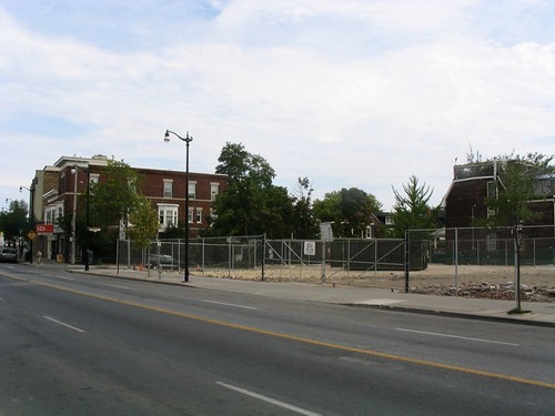
Photo: St. Thomas St, Yorkville

A second construction hoarding was erected on St. Thomas St south of Bloor recently, across the street from an existing hoarding (which has since been taken down). For a short time, the two facing hoardings protecting the sidewalks appeared to resemble a street lined with arcades, in its small spatial scale not unlike many you will see in southeast asia, such as this one in Singapore.

Street with arcades, Singapore
Photo: Street/lane in Singapore

This small scale of space is a relatively infrequent occurrence in Toronto, especially as part of a public street. While we’re used to such small scales in our back alleys, those alleys are, with but few exceptions, the city’s backdoors – infrequently travelled and largely empty, with few uses facing on to them other than the occasional residence and dominated by garages or blank walls and service entries. They do not really form a part of the public face of the city or city life.


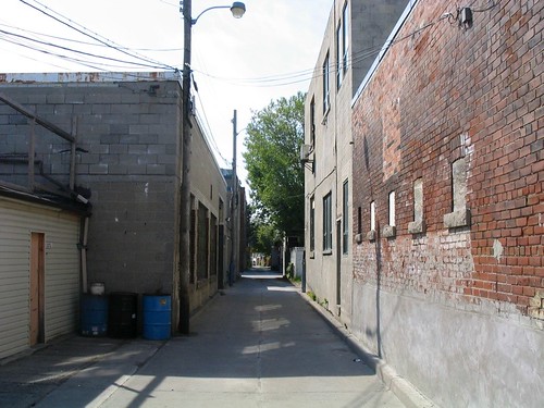
Photo: Laneway in the Junction


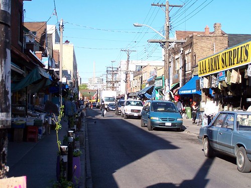
Photo: Kensington Market (photo by raptortheangel)

Somewhere approaching this scale of space that is part of the public face of the city is most famously exemplified by Kensington Market, where not only the buildings, produce and products are jostled up against the sidewalk, but the streets are narrow and bustling with people, and to add to the compression of space, filled with parked cars and delivery trucks and slowly crawling traffic. It all adds up to a very human (dare we say humane?) scale that somehow makes you feel comfortable, as though you’ve been enveloped in the city. In fact, Kensington moves beyond a sense of space, and somehow transcends that rather empty word, to have evolved a sense of place, one that is both undeniable and unique.


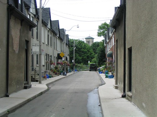
Photo: Wilkins Ave, off King St E, east of Parliament

There are a few other examples of small space in the city, but they tend to be rather hidden and brief moments – although that just makes them seem all the more jewel-like when you discover them.


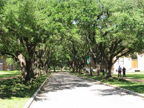
Photo: Tree-lined street at Rice University, Houston

While small space is not the only way to attempt to foster sense of place, I think that there is some connection between this sense of scale, sense of space and sense of place. Similar effects of scale can even be created by the canopies of closely-spaced street trees, as at Rice University (above), but can also be misguided in implementation as in this accident of line-of-sight where Casa Loma’s tower is perfectly framed by the laneway between Walmer Rd and Spadina Rd south of Davenport, which doesn’t so much benefit the laneway itself, but creates some sense of drama and intrigue for all those people walking along MacPherson Ave towards George Brown College.


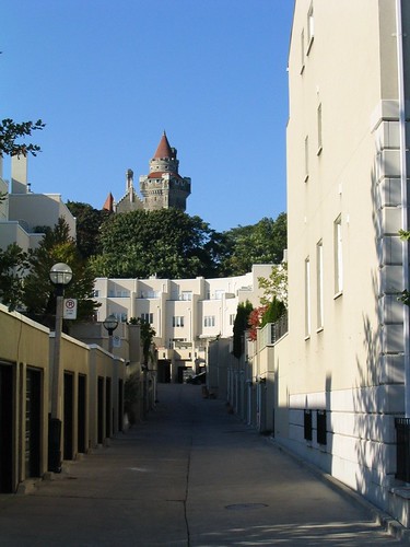
Photo: Looking towards Casa Loma up rear lane between Walmer Rd and Spadina Rd

Whether or not anyone agrees with me about the importance of small scale when it comes to sense of place, I think we can safely say that a key missing ingredient in the urbanities being created in suburban locales around Toronto (and the rest of north america) is the absence of small-scaled space. This absence has been compensated for in many different ways, but most notably (need I say, horrifically and ironically?) by the deliberately pedestrian scale of space of the “shopping street” inside the typical mall and, more recently, by the creation of “pedestrian-oriented” centres in suburban locales, usually surrounded by seas of parking and/or parking garages and huge arterial roads and/or expressways. These new “centres”, sometimes presumed to be the end of the mall (and often replacing them), are in reality the mall’s evolution into a more plausible (but still staged) “reality”, one that is once again based upon the smaller scale that has become nostalgically associated with our cities’ historic centres and main streets.

Whether this small scale can once again be more fully integrated into the urban environments we are building may depend on the level of commitment we as a society are willing to make to creating spaces and places planned and designed around people instead of cars. On this question the jury’s still out. Despite recent progress and a lot of talk to the contrary, the evidence on the ground does not convince.

ROM Crystal Architectural Opening


Photo: Textile & Costume Gallery, 4th floor

Finally made it into the ROM’s new Crystal by Daniel Libeskind as part of the museum extension’s grand architectural opening. The building is being shown empty to give an opportunity to appreciate the architecture itself, though it looks like that should be quite easy even once exhibits are in. It’s a building with a large number of quirks, odd corners, strange views and peepholes, extreme awkwardness, and near sublime austerity – and though it’s very photogenic (it’s hard not to take an interesting photo inside), right now it’s very hard to love.

It’s new, it’s weird, it’s eerily fascinating. But there are a few moments that seem to fail the visitor so miserably, that love is not a word that can be associated with this building. The new main entrance is an awkward angled slot off Bloor, and when you do get inside, prepare to be literally underwhelmed – the first impression is awful. Move through to the Gloria Chen Court and you finally get to experience some of the grand spaciousness one would expect of a great museum – however this court doesn’t feel like it leads anywhere now that the Samuel Hall is basically just a lounge, nor does it seem to perform any understandable purpose (for example, aiding in spatial coherence).

Having said all that, the galleries themselves are fun and weird – but who would actually want to fill them up with exhibits? And there lies the central problem of such architectural grandstanding for an institution such as the ROM – what does it have to do with the ROM, its purpose, and the gallery content that will eventually fill these spaces?


Photo: Looking down from 3rd floor


Photo: Middle East/South Asian gallery, 3rd floor


Photo: Africa, Americas & Asia Pacific gallery?, 3rd floor


Photo: Dinosaur gallery, 2nd floor


Photo: Dinosaur gallery, 2nd floor

Despite the Crystal being so photogenic, without exhibits in its halls it is strangely barren, uninviting, cold and austere – as a result it is hard to feel very comfortable in any part of the new building – in fact, one gets the impression that we’re not meant to feel remotely comfortable. The most comfortable (and welcome) new addition is actually the wonderful new Food Studio cafeteria in the basement – a vast improvement over the previous cafeteria iterations and a comforting and naturally-lit space (and no, barely an odd angle in sight).

If it’s comfort you want, a foray into the original building will remind you of an architecture that is about more than simply a form – a walk up the original grand staircase with its skylight and huge 4-storey-high totem poles will show up the new stair’s gimicky angular forms. To stare up into the mosaic of the vault above the Eaton Court will remind you of what the museum is supposed to be all about – there it is written (slightly archaically): “That all men may know His work”. And no, the He of His does not refer to Daniel Libeskind.

More photos in our Flickr set.


Photo: Food Studio cafeteria, basment

Trafalgar Square goes green with turf

trafalgar-square-turf.jpg

It might look like a clever Photoshop exercise, but Trafalgar Square in London was actually turfed over for 2 days last week as part of a campaign to promote green spaces in the city. The grass will be moved to a nearby park at the end of the event.
Photo & Source: BBC News

A plea for more seating

Improvised Seating

With summer fast approaching, we’ll be seeing more and more people out on the streets, hanging out, talking, eating their lunches and generally enjoying being outside – as Canadians tend to do when fine weather brings us out of winter’s clutches. But where are they doing all these things? Surely we’re not all standing around on street corners, loitering in front of doorways or squatted on the pavement?

No, it’s this time of year when finding a plum bench or seat in a nice location at lunch time is something like trolling the streets looking for a parking space. But is the culprit just too many people in a concentrated area all out at the same time, or is it really that we have a sadly deficient amount of seating in public areas in Toronto? And I don’t just mean benches – seating walls, stairs, ledges, chairs, window wells – people will sit on almost any horizontal surface within reach (as the couple in the photo above show in such intimate fashion).

It certainly seems as though in many of the most bustling parts of the city there are hardly any places to sit along streets or at intersections where all the action is happening. I hope that we can improve on the current situation in future, and sincerely hope that the current transformation of Toronto’s waterfront will provide ample (nay, over-ample!) seating of every kind and for every occasion.

Photo: Couple seated in a wall along Balmuto Ave opposite the Manulife Centre

MVVA wins Lower Don Lands competition

The TWRC announced yesterday that the Michael Van Valkenburgh Associates, Inc. (MVVA)/Behnisch Architects/Greenberg Consultants/Great Eastern Ecology team won the Lower Donlands Design Competition. More information on the team’s entry can be found at the TWRC site.

mvva-img2-2-sm.jpg

mvva-img3-sm.jpg

mvva-img4-sm.jpg

The full team included:

Michael Van Valkenburgh Associates, Inc. (MVVA), New York & Massachusetts, USA
Limno Tech Inc., Michigan, USA
Applied Ecological Services Inc., Wisconsin, USA
Great Eastern Ecology, New York, USA
Greenberg Consultants Inc., Ontario, CANADA
Behnisch Architects, Los Angeles, CA, USA & Stuttgart, DEU
Transsolar Energietechnik, New York, USA & Stuttgart, DEU
RFR Engineering, Paris, FR
Totten Sims Hubicki and Associates (TSH), Ontario, CANADA
ARUP, Ontario, CANADA

Congratulations (and commiserations) should also go to the other teams for very fine submissions, particularly the Weiss/Manfredi DTAH scheme which I’m sure was a very close second.

A plea for subtle signage

Just back from Houston, a city which, despite its problems, has some fine moments and some beautifully detailed parks and streetscapes. This stepped edge of a pond in Hermann Park simply uses subtle carved words to ask people not to enter the water. In case you think people should be allowed in the water, there was an area for that too!

286 8615

Too often, it’s easy to forget how signs (particularly restrictive ones) can clutter and dominate public places. While there’s plenty of place for sign clutter on heterogenous and chaotic streetscapes, their intrusion into more passive and contemplative spaces can seem offensive and misplaced.

Hermann Park, re-masterplanned with design projects ongoing by landscape architects Hanna/Olin (now Olin Partnership) and SWA Group (including Keiji Asakura, now of Houston-based Asakura Robinson) and funded by a non-profit group, is a stand-out example of quality urban park refurbishment that practices restraint and holds the line against the commercialisation of public space.

Designs released for Lower Don Lands

mvva-img2-2-sm.jpg

The designs for the Lower Don Lands from the 4 shortlisted teams in the “Innovative Design Competition for the Lower Don Lands” being run by the TWRC were released today in conjunction with an exhibition (including lovely models) at BCE Place. The Exhibition Launch and Public Forum is on Monday April 16 from 6-9 pm at the Allan Lambert Galleria in BCE Place (181 Bay Street). PDF’s of the full display panels are available from the TWRC website.

———————————————————-

STOSS INC./Brown + Storey Architects/ZAS Architects

stoss-img1-sm.jpg

stoss-img2-2-sm.jpg

stoss-img5-sm.jpg

stoss-img4-sm.jpg

STOSS INC., Boston, MA
BROWN + STOREY ARCHITECTS, Toronto, ON
ZAS ARCHITECTS Inc., Toronto, ON
Brookner Studio
Nina-Marie Lister
Applied Ecological Systems
Pine + Swallow Associates
Nitsch Engineering, Inc.
Moffatt + Nichol
ARUP
Kidd Consulting
Consult Econ, Inc.
The Map Office

———————————————————-

MVVA/Behnisch Architects/Greenberg Cnsltnts/Great Eastern Ecology

mvva-img1-sm.jpg

mvva-img2-2-sm.jpg

mvva-img3-sm.jpg

mvva-img4-sm.jpg

Michael Van Valkenburgh Associates, Inc. (MVVA), New York & Massachusetts, USA
Limno Tech Inc., Michigan, USA
Applied Ecological Services Inc., Wisconsin, USA
Great Eastern Ecology, New York, USA
Greenberg Consultants Inc., Ontario, CANADA
Behnisch Architects, Los Angeles, CA, USA & Stuttgart, DEU
Transsolar Energietechnik, New York, USA & Stuttgart, DEU
RFR Engineering, Paris, FR
Totten Sims Hubicki and Associates (TSH), Ontario, CANADA
ARUP, Ontario, CANADA

———————————————————-

Weiss/Manfredi & du Toit Allsopp Hillier

weiss-manfredi-img4-sm.jpg

weiss-manfredi-img1-sm.jpg

weiss-manfredi-img3-sm.jpg

weiss-manfredi-img2-sm.jpg

Weiss/Manfredi, New York, NY
du Toit Allsopp Hillier (DTAH), Toronto, CANADA
McCormick Rankin Corporation
Golder Associates Ltd.
Biohabitats, Inc.

———————————————————-

Atelier GIROT/Office of Landscape Morphology/ReK Productions

ateliergirot-img1-sm.jpg

ateliergirot-img2-sm.jpg

ateliergirot-img3-sm.jpg

ateliergirot-img4-sm.jpg

ateliergirot-img7-sm.jpg

Atelier GIROT, Zurich, Switzerland
Office of Landscape Morphology, Paris, FRANCE
Jürgen Mayer H., Berlin, GERMANY
ReK productions
Arup, California, USA
Philip Ursprung
Applied Ecological Services