Urban Fabric & Form Comparison
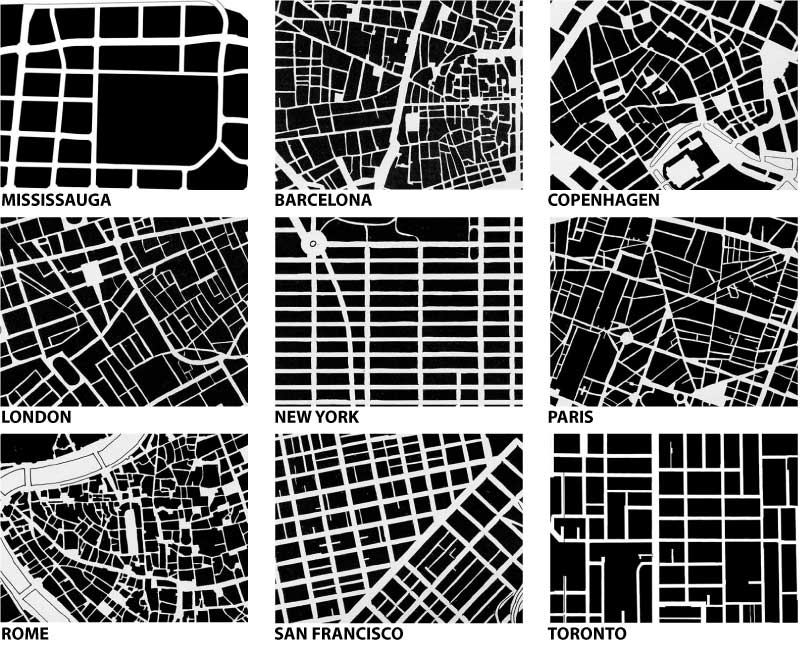
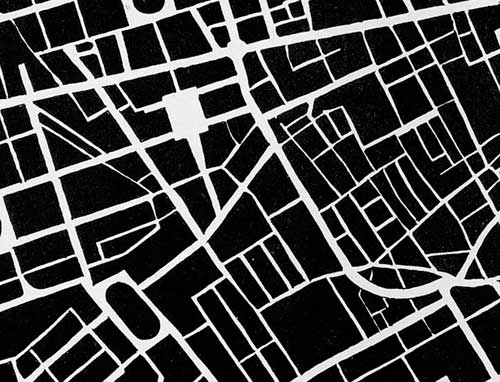
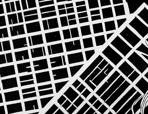
The Star today published a cover story (Beyond Density) in their Condos section on the efforts in Mississauga to create a more vibrant and pedestrian-friendly downtown – key among the problems identified has been the large scale of the block patterns in Mississauga – to prove the point the article includes urban form/fabric drawings of 9 cities (one hopes at the same scales) in order to compare the scales of the fabric of the street network. I include the drawings below alphabetically (with Mississauga first).
(edit: a friend requested I lay out all the drawings in a grid for easier comparison – I hope you enjoy – click on the above image for a larger version)
More than anything, the comparisons expose the inherent problems of scale in trying to evolve any suburban, auto-oriented area into a more pedestrian-oriented centre. The traditional response in suburbia has been to internalize pedestrian areas (in the form of the mall), Square One (home to the largest Walmart in the world) being a particularly powerful example, though Scarborough Town Centre might be the more classic one. The size of Square One’s block makes a very interesting comparison with Copenhagen’s city centre (3rd below) in which a series of streets and spaces have been linked together and pedestrianized (view a map of the pedestrian areas of Copenhagen from Metropolis magazine). In size or length of pedestrian space, the two might even be close, but in overall character and degree of integration into the urban fabric (particularly important for pedestrians) they are from wholly different worlds and you can easily trace much of these differences to the scale of the street fabric.
The other striking lesson from such comparisons is that there really is no perfect form of street fabric – many different networks and patterns are capable of producing wonderful places and being friendly for pedestrians as long as their fabric allows frequent and comprehensive linkages – there simply seems to be an upper scale beyond which all hope of efficient (and therefore popular) pedestrian circulation is gone.
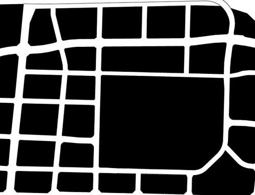
MISSISSAUGA: “Long blocks and virtually empty sidewalks”
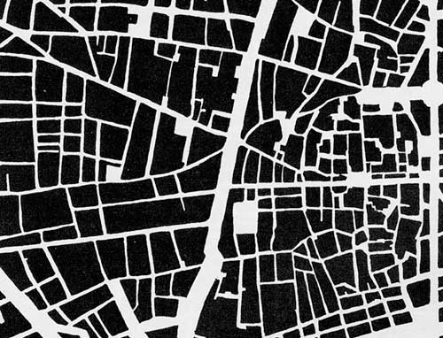
BARCELONA: “La Ramblas is the main north-south promenade”
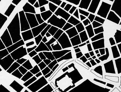
COPENHAGEN: “City features a car-free zone called the Stroget”
LONDON: “The Mayfair and Soho districts south of Oxford St”
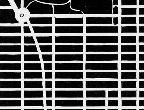
NEW YORK: “Midtown Manhattan south of Central Park”
PARIS: “Streets were designed by Georges-Eugne Haussmann”
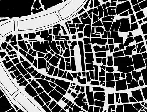
ROME: “East of the Tiber River bend that points to the Vatican”
SAN FRANCISCO: “Market St splits the central city into two grids”
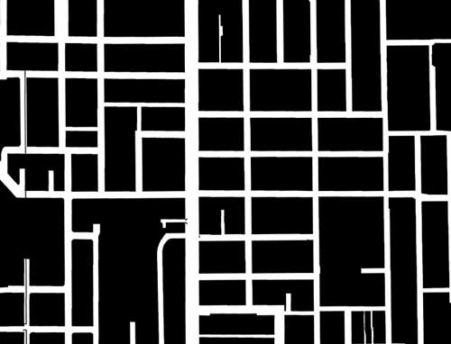
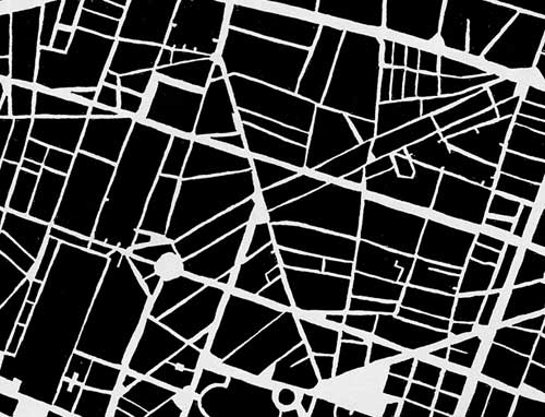
TORONTO: “Between Queen and College Sts east of Bathurst”

18 Comments so far
Leave a comment
Who made these images, where did they come from?
By Ryan Marr on 01.27.08 2:22 am
This was a compelling article–mostly because it was interesting to see the striking graphic comparisons in figure-ground format between the different city centres, side-by-side on the page. Your format, placing them one atop the other, is less effective, although it’s great to have the drawings at the scale you show them. Could you do both though? I mean, add a page with the six layouts at a scale making it possible to see them all at once?
Another interesting comparison would be to include the inner pedestrian realms of the megablocks–so we’d see the PATH system of Toronto as a system of streets undercutting the large block patterns. I’m always a little depressed when I walk the PATH–thinking about the fact of all those “missing” pedestrians in the public realm above–and always a little surprised when I resurface, to find that even with the thousands and thousands of people streaming along in their underground conduit, there are still quite a few folks on the real streets, too.
By the way, although the Star never gave credit, I think I recognize the plans it produced as being from the Allan Jacobs book, “Great Streets”–you probably know it. I found a representative sample through google images just now (note misspelling of Allan Jacobs’s name): http://tinyurl.com/yu5cle
By jake on 01.27.08 11:54 am
The Star article gave no attribution, so I assumed they were produced in house, but I think you’re right Jake that most have in fact been lifted from Great Streets – with the exception of the Mississauga and Toronto maps which look like they have been done on computer instead and wouldn’t have been in Great Streets…
By rc on 01.27.08 12:41 pm
[…] found a cool article on city structures by Bricoleurbanism, a Canadian blog which focuses on the city, the landscape and the fields that […]
By Perfect City - Discussion about the future of our cities » Blog Archive » Urban structures – A comparison between different cities on 08.28.08 4:32 am
I believe they were made by Manuel de Solà-Morales, and were featured in this book:
http://www.amazon.com/FORMAS-CRECIMIENTO-URBANO-Manuel-Sol%C3%A0-Morales/dp/8483011972/ref=sr_1_6?ie=UTF8&s=books&qid=1219949330&sr=1-6
By manel on 08.28.08 2:49 pm
[…] Vi num post sobre desenho das ruas vs facilidades para os pedestres. […]
By Desenho Urbano on 10.05.08 2:44 am
this info really helped in understanding of urban pattern
By abhijit on 11.19.08 8:17 am
I have checked the scale of the Star’s (Sola-Morales’s?) drawings. They are all at the same scale, with about 0.87 mile (1.4 km) on the long side. This includes the Mississauga drawing, although that drawing’s style is subtly different from the others. The drawings in Allan Jacobs’s book were all 1 mile (1.6 km) square.
By Prof. Bruce Ferguson on 01.04.09 10:51 pm
[…] also I found via Bricoleurbanism a visual of urban form/fabric drawings in 9 cities, which does a great job of visualizing the […]
By Smaller City Blocks | Superfluous City on 10.17.10 10:45 am
Hi, all!
I lived for almost 5 years in Waterloo and used to go to Toronto, many times trhough Mississauga….It is a loosing time to compare cities of different cultures as well as it is difficult to established a “new-order” to North American Urbanism. Now I am teaching Urban Design in Brazil and I think that (medium 130 hab/ha of Firenze) density and mixed use (see Jane Jacobs–Boston North End) is the solution for poor pedestrian life in Toronto and in many others Canadian cities. Not only for recovering quality of life but also to survive of a new housing/financial/economic crisis such as 2008’s Leman Brothers and the like.
Prof Roberto de Oliveira, PhD
By Roberto de Oliveira on 11.15.10 6:09 pm
Thank you for the article.
I liked it,and would like to know more about the topic,Is there any refrences can help me to understand each one of this pattren charactrictics ?!!
By Jowan on 01.15.11 1:43 pm
[…] mönster i några olika färgställningar. Inspirationen kommer från städer avbildade såhär. Kompenserar att det inte blivit en om dagen på sistone med ett gammalt projekt, ett second […]
By 35. « have another one on 04.24.11 5:18 pm
[…] Fabric of Paris […]
By Seeing Like a Social Network | Savage Minds on 07.30.11 10:00 pm
[…] Fabric of Paris […]
By ME Feed: Seeing like a social network. « MEgalomania on 07.31.11 9:08 pm
great
By Yalin on 04.09.13 9:30 pm
[…] understanding of/bird’s eye perspective on urban fabric(s) (from e.g. city planning as seen here: https://www.bricoleurbanism.org/ideas/urban-fabric-form-comparison/ ) to the actual configurations and compositions of texture and their relation to experience in and […]
By An Ethology of Urban Fabric(s) | post-digital-research on 10.01.13 11:01 am
[…] economic and sociocultural (…)” (Wikipedia), from an ideal top-down perspective (see e.g. Bricoleur Urbanism). Here, however, we would like to explore a non-metaphorical understanding of urban fabric(s), […]
By An Ethology of Urban Fabric(s) | post-digital-research on 12.05.13 4:39 pm
If you overlayed the optimum circulation pattern for pedestrians over that for vehicles you would get a contradiction.
They should probably be on different levels.People move from place to place (nodes).Vehicles move from intersection to intersection. (nodes).ie grid vs medieval.A hybrid or nodal planning is required.
By geoff blamey on 08.24.15 11:34 pm
Leave a comment
Line and paragraph breaks automatic, e-mail address never displayed, HTML allowed:
<a href="" title=""> <abbr title=""> <acronym title=""> <b> <blockquote cite=""> <cite> <code> <del datetime=""> <em> <i> <q cite=""> <s> <strike> <strong>