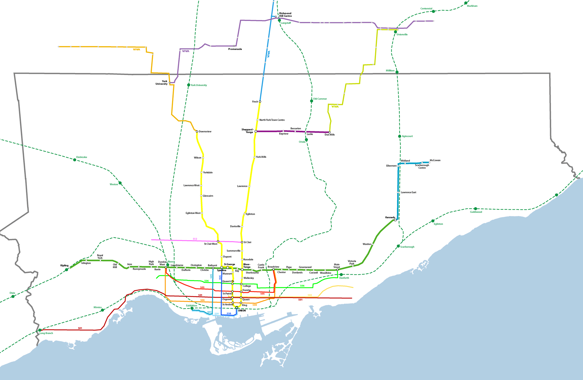
Toronto Transit Map Reimagined
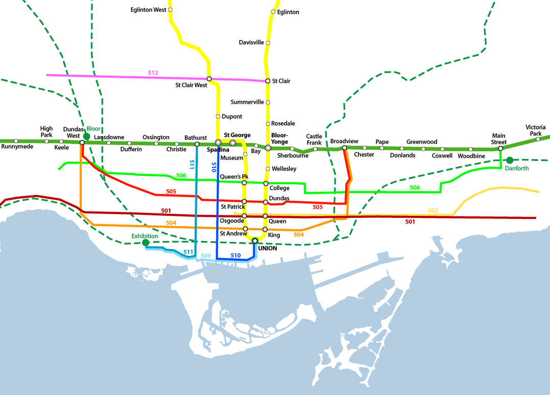
Somewhere someone was asking for someone to come up with a reimagined transit map for Toronto (could it have been Reading Toronto here?), so I thought I’d give it a shot. The one Graeme Stewart posted at Reading Toronto is interesting but I find it too schematic-looking. At the GTA level, scale is grossly distorted, but on the downtown detail map I love how he managed to integrate neighbourhood names into the map. Fantastic.
Part of his point was that more of the system should be shown than just the subway – the GO lines and the streetcars should be shown to represent more of the true nature of the “system” and I think I support his idea. However there are certain caveats and problems:
- Apart from supposed “dedicated right-of-way” LRT streetcar lines (such as Spadina’s 510 line and the Queen’s Quay lines and the western portion of the Queen 501 route along the Queensway), streetcar lines in Toronto are having serious problems moving swiftly through the city. One hears complaints of people being able to walk faster than the Queen cars move through traffic. Even the dedicated right-of-way lines have issues – a report I read indicated that the Spadina car on average is slower at getting its passengers down to Queen than the old pre-1997 buses were – I also have friends who live out near Mimico for whom in most cases taking the subway and getting a bus is quicker than the 501 car. This does beg the question of whether they should be included when some frequent service time-efficient bus routes are not.
- On Stewart’s GTA map (here), GO Transit’s rail network is given heavy prominence next to the subway lines. Indeed on GO’s own system map, their train network is given heavy coloured-line subway-like prominence, with the bus network as more generic thinner green lines. I flirted with this idea, but for now have settled for a more toned-back approach to the GO network for the simple reason that until higher frequencies are achieved and more serious urban centre-type development occurs around GO stations, the system currently bears little resemblance (in reality) to an LRT, BRT (Bus Rapid Transit), or subway system since it is heavily skewed towards commuter traffic alone.
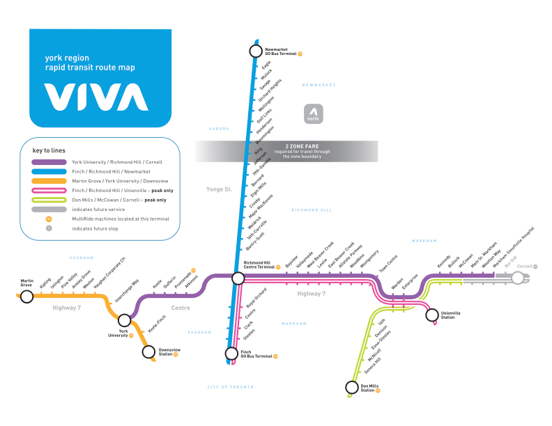
- VIVA is here – York Region’s BRT transit offering is up-and-running (for a year now), and should be given heavier priority at the regional scale. I dream of a day when an integrated fare-structure allows simple and straightforward use of all these systems together with full transfer privileges and no complications – perhaps trying to envision what the system even looks like as a whole is the first step? For now I have only shown full-service routes of VIVA, not peak-only. I don’t actually even know whether any of the other GTA municipalities have BRT-equivalent frequent-service routes to add – if they have, I haven’t heard of them.
I am also working on a full GTA level map showing all GO lines to their ends. All of these maps are real-scale without distortions in space – the disadvantages are that at smaller sizes, things become harder to read and distinguish. It could be that after I’ve done these, then a simpler diagram version could be done that distorted distance as most existing transit maps do.
Style – I’ve tried to stick to the current TTC diagram style. Why? I kind of like it. I am from Toronto though. Others, such as Miguel Syyap’s quite wonderful TTC maps, have used London Underground’s famous style – which I must say looks good too! For some reason Syyap hasn’t shown an as-is system map using his style though. VIVA has adopted this same style for their diagrammatic system maps.
Here’s links to higher resolution versions of my map:
Toronto Transit Map – downtown detail
Let me know what you think – any suggestions?
Also see our evolution of the TTC subway animated map from September 2007.

7 Comments so far
Leave a comment
Excellent start to what is desperately needed. I like the idea of a rapid transit map. Rapid being the key here.
I would argue that in your map, the go lines should be equally as strong if not stronger than the subway lines. I don’t know the numbers, but I would imagine they transport a large amount of people comprable to the subway lines. Plus its a scale thing, these lines feed the burbs.
Also, I think the streetcar lines should be differentiated between dedicated and non-dedicated transit lines. Maybe dash the queen or king lines as they appear graphically to be slower than a solid Spadina line which runs faster. (And living in the Queen Spadina area for 10 years, I have experienced the difference between the dedicated streetcar line and the bus route. The streetcar line is much more reliable and QUICKER. There is no bias to this)
One other thing, design the map so it fits on 8.5×11 paper. People should be able to print it at home. In this case the text should be made to match this size.
There’s my 2cents, if its worth that much.
Good luck.
tonto.
By tonto on 11.08.06 6:43 pm
I agree with most of your comments tonto.
I think I’ll place more emphasis on the GO System at the regional scale, but at the city of Toronto scale I think that the low frequencies and low within-city ridership doesn’t warrant the emphasis – GO deliberately caters to traffic from outside Toronto commuting in, which does not make it a particularly useful part of day-to-day movement within the city of Toronto itself. GO’s trains transport about 160,000 riders a day – 95% of which is to or from Union Station. The subway meanwhile tranports 904,000 riders a day all over the city. You do the math, but I’d say subway gets graphic priority over GO network. How ’bout streetcars, you ask? All of the streetcar routes together transport 259,600 riders a day – more than 1.6 times the number transported by GO trains. So as I said, unless GO dramatically improves service levels and ridership, they might not deserve higher graphic representation.
I’ll take your word for the Spadina Streetcar improvement – I’m glad not everyone disagrees with it – I used to hate the way the buses would fling you all over the place as they zoomed in and out and around Spadina Circle.
One disappointment I have with that spadina streetcar project (and the streetscape improvements that accompanied it), is the character of the spadina chaos that disappeared – somehow the design of the tracks, and the new roadway layouts make the whole street feel like one big transportation artery rather than one of the most amazing outdoor market streets I ever saw.
I suppose that this is the price we pay for favouring easy movement through a place over the character of the place itself – I fear for the same thing along Queen. While the streetcars stuck in traffic are obviously ridiculous, the question remains whether Queen would still be the great Main Street that it is once through traffic (whether transit or vehicular) is given priority. While the idea of a Queen subway is deader than dead and will never happen, the beauty of underground rapid transit is in allowing the streets to be a wonderful chaos perfect for pedestrians while privileging transit users with extremely quick service. Bloor West through the Annex (outside of rush hour, when restricted parking turns it into a traffic artery) is a perfect example of how the chaos of parked and parking cars, and choked traffic makes for a great pedestrian urban experience. The presence of the subway means that the traffic doesn’t incovenience transit movement.
The BRT-LRT strategy inevitably becomes reliant on extremely wide road right-of-ways and the pursuit of the idea of the Avenue – this is something difficult to do in older parts of the city, and it also creates a vastly different scale to the street. Intimacy is difficult, and in the Avenue-as-Artery paradigm, I fear it’s the pedestrian that loses out, as hopping across the street becomes harder and harder. While Steve Munro indicates on his site that he finds crossing Spadina easier with the streetcar exclusive-right-of-way, I quite dislike having to stand on the narrow (sometimes only curb-wide) medians making sure I’m not about to be sideswiped by a swiftly-moving streetcar – and of course at every streetcar stop, metal railings prevent you from taking the course of desire.
By Editor on 11.09.06 11:44 am
“GO deliberately caters to traffic from outside Toronto commuting in”
I have to say:
I question the validity of Go’s strategy
By Martin Cleaver on 03.20.07 8:55 pm
I disagree with the comment rc left back in October 28, 2006 where she said that she read somewhere that the LRT is slower to get down to Queen from the Spadina Station than the bus route used to be. You can’t always belive everything you read okay, a lot if not some things people write in these sources most of the times are just based on their own personal opinions. Most of the time you have to look at the actual facts. I take the LRT from time to time along Spadina Avenue and on the whole, the cars fly along the central median. There are more of them now than there were buses back then (even though I have never been on it back when it actually used to be a bus route, but I used to go down there from time to time with my parents and see them. I have been paying very close attention to service frequency on routes since I was 7 years old, so I know what it used to be like) and for the most part has made business even better and busier than before when I go down there. It has also cleared a lot of the congestion of traffic on the street as well. Spadina now is way better and always will be with the LRT now than it used to be with the buses then.
By Rob Italiano on 04.23.07 12:44 pm
[…] see our reimagining of the TTC transit map from October […]
By Bricoleurbanism » Growth of Toronto’s Subway on 07.20.10 9:55 pm
Vic Gedris just told me about this map–kinda dense but kinda great, too: http://crazedmonkey.com/toronto-transit-map/
By allderblob on 04.30.12 10:20 pm
Transit Priority is problematic with the Spadina, Queen’s Quay and St. Clair lines becuase of the street width, close signal spacing and short headways. Short blocks and closes signal Spacing, especially on St. Clair with Oakwood, Alberta and Winona means that cycle times need to be short to keep cars being stopped in one intersection by a red light at the next. Wide streets require long crossing ties so that pedestrians don’t get caught in the middle of the road. This does not leave much flexibility for transit priority That being true there can still be room for improvement by change the traffic light cycles to minimize transit time rather than auto time. I think that this has been done to some extent on St. Clair and Spadina. Every time I drive those streets, once a week on Thursdays, the light cycles seem to be different, especially St. Clair.All intersections where street cars can make a left or right turn should have the ability to give the street car a turn signal. This should be at the start or end of the green phase depending on which is needed by the LRV. The newer cars with all door boarding and low floors should make the service run faster, especially on the right of way lines.It is impossible to keep transit vehicles on an even headway when the headway is not a multiple of the cycle time though it should be possible to do better than 11 and 1 then 11 and 1. The problem on Spadina worse south of King becuase the road is so wide and there is no “Island of Refuge” in the middle except at Bremner so pedestrians can be forced to take it in 2 steps as occurs on University Ave. Spadina and Front is especially bad becuase the predominate p.m. movement is west to south which results in a long left turn phase for Front street which has to followed by a long pedestrian phase for pedestrians on the south side to cross Spadina. Queens Quay is disaster of planning from the word go but hopefully things will improve when the street is rebuilt. I have seen times when the signals appear to change for the street cars just before they arrive and stay green long enough for 2 cars to go through, then there are the other days when a cross street light stays green forever and there are no cars or pedestrians crossing. Perhaps these lights should only turn green when a vehicle is detected at the intersection or a pedestrian pushes the button. The length of the green could be shortened to what is needed rather than 30 seconds when there is only 1 car present. In the summer months there is a lot more people and cars in the area and traffic would be a problem but it would help the rest of the time.Transit Priority Signalling is not going to be able to:1)turn a light green as an LRV approaches without endangering pedestrians.2)keep a signal green at a major intersection for much longer without throwing the entire network into confusion. It is a vast grid of streets and not just one road that is affected.Traffic signals can:1)provide turn phases for streetcars and buses.2)have their timing adjusted to maximize the flow of transit instead of autos. Especially if those routes get low floor LRV’s with all door loadings.
By Kader on 10.20.15 3:23 am
Leave a comment
Line and paragraph breaks automatic, e-mail address never displayed, HTML allowed:
<a href="" title=""> <abbr title=""> <acronym title=""> <b> <blockquote cite=""> <cite> <code> <del datetime=""> <em> <i> <q cite=""> <s> <strike> <strong>