urbanism – landscape – ideas – theory – whimsy

Favela Japonesa

un11214934gf-sm.jpg

A friend’s Portuguese cousin sent these awesome images to him and he duly forwarded them to me. The title really says it all: Favela Japonesa indeed! Of course, perhaps a more flexible usage of the concept is required than the english equivalents shantytown/slum – my mind’s drawing a blank, but in spanish, the word barrio, while carrying the same connotations (particularly in Venezuela), also simply means district or neighbourhood. Whatever the word should be, we like where this idea is headed… for something mildly related, don’t forget to check out the Personal Container Management post from November, and to see 50 selected projects utilizing shipping containers try fabprefab.com.

Addendum (May 2010): a commenter indicates that this is actually a Dutch student housing project at the University of Utrecht called Spacebox – 300 units have been built

un21533268qr-sm.jpg

un32471248ch-sm.jpg

un43016825tw-sm.jpg

un53028353hq-sm.jpg

un01210319eh-sm.jpg

Lower Don Vision – bricoleurbanism style

lowerdon_bricoleurbanismorg_crop2.jpg

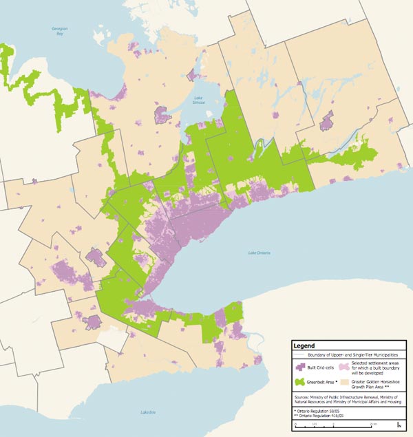
The TWRC recently put out a call to Torontonians for visions for the Lower Don Lands and the mouth of the Don River (see here), perhaps as a consolation for the closed, restrictive process they seem intent on following for their “Innovative Design Competition for Toronto’s Lower Don Lands” for which they released a shortlist on 2 February (see here).

Maybe they thought that the Innovative Design Competition for the Central Waterfront (see here) was so successful, they figured they’d just do the same thing over again. At least it’s clear that they’re intent on moving forward with winning schemes into implementation, which is not always the case.

But starting off with an RFP process is hardly a way to get the maximum number of people involved. While they say that they’re “seeking input from the world’s most talented and creative design and engineering professionals in developing bold new concepts for the Lower Don Lands area”, it hardly seems likely that the world’s most talented and creative people have been boiled down to the 5 shortlisted teams. The proposals themselves are never released publicly, only the finalists’ entries are, so at best we get 5 concepts to publicly review and have to rely on the wisdom of the shortlisting process to have chosen teams that might produce the most innovative design responses.

While the process obviously can work (quite a bit of attention was generated with the Central Waterfront competition), it does have drawbacks – the winning team for the Central Waterfront (West8/DTAH) was a clear winner since most people were less than impressed by the other teams’ submissions. The fact that the Nathan Phillips Square competition (see here) is being run in the same way, makes it clear that a wide spectrum of ideas is not what public agencies in Toronto are really after.

Which leaves some designers and Torontonians (either those not shortlisted, or ineligible to compete by virtue of not being on a team with all the requirements demanded by the RFP) shit out of luck. Cue the “Submit Your Vision for Toronto’s Lower Don Lands”. However, being limited to a single double-sided letter sized page is certainly unusual for most designers, so it’s obvious that they really are looking for the ideas of the average Torontonian.

And as for design students, who traditionally are keen submitters to competitions (if only because their studios are often based on a current competition), whatever ideas they may have come up with, they’d better fit on that double-sided page too.

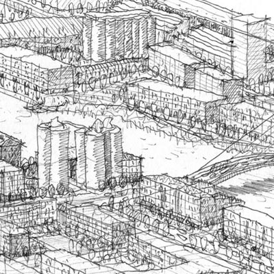
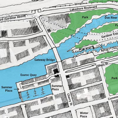
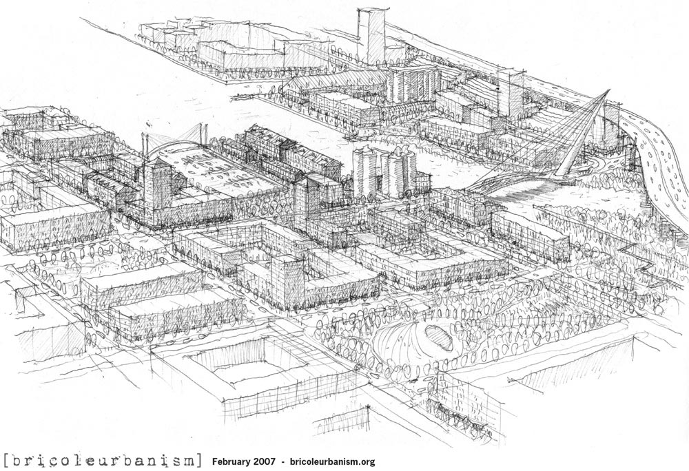
So, even if only to get the ball rolling and get some ideas out in public (where’s the TWRC going to hide all the visions submitted by Joe Public?), bricoleurbanism.org is proud to here present our vision for the Lower Don Lands. Click on the images to view the full drawings.

lowerdon_bricoleurbanismorg_crop4.jpg

Mapping Our Urbanism Part III – Water Mains

to_watermains_early2_e.jpg

In the Toronto Star last weekend was a special 2-page spread on the sorry state of Toronto’s water mains with emphasis on who’s to pay for upgrades (see story online here). However, the maps included give a fascinating glimpse into the history of Toronto’s development seen through the age of the water mains. Divided into four periods, 1859-1900, 1901-1940, 1941-1960, and 1961-2000, these maps are indispensable for anyone interested in the history of urban infrastructure. To see a little more detail, follow these links (maps 1+2, maps 3+4) – if you prefer a much more detailed PDF version of the maps is available from the Star’s site here (PDF).

to_watermains_modern2_e.jpg

Crossposted to the Spacing Wire

Mapping Our Urbanism Part II – Extents

ggh-growth-areas_det-e.jpg

The Ontario Government’s revolution of planning in this province continues to move forward. The Places to Grow initiative (Growth Plan for the Greater Golden Horseshoe, see here) has been given a benchmark by a Technical Paper on a Proposed Methodology for Developing a Built Boundary for the Greater Golden Horseshoe, “an important component for monitoring the implementation of the Growth Plan” (see here). Essentially, what has been created is the most uptodate database of the current extents of development in the GGH (and by extension, the GTA). Knowing the current extents of development is crucial to being able to evaluate progress on the stringent intensification requirements demanded by Places to Grow and the implementation of the greenbelt.

What’s great for the purposes of mapping our urbanism is that these maps (excerpted from the new Technical Paper) give us an accurate and uptodate view of the extents of the city and greater region as it is essentially right now, and also how the extents of current development fit into the protected land of the greenbelt. This is quite a unique view of things, and one that is much clearer to read than a satellite photo.

ggh-growth-areas2e.jpg

Mapping Our Urbanism Part I – Snow Ploughing

snow-plow-map_toronto_det-e.jpg

snow-plow-map_toronto_leg-e.jpg

It might seem bizarre, but this map of sidewalk snow plowing service (which I found inside a publication called City Routes put out by Toronto’s Transportation Services available online here) speaks volumes about the different urban forms across the City of Toronto. The zone defined by the inner red line contains “areas where vast majority of sidewalks cannot be ploughed”. The reasons given are that “sidewalk snowploughs are not able to operate effectively due to sidewalk width and a lack of boulevard space for snow storage”. No doubt on-street parking also plays a role, but the policy is also a legacy from the pre-amalgamation City of Toronto which to a large degree fell within the two reddish lines on the map, and which relied on residents and businesses to clear the sidewalk in front of their own premises.

However, using the old boundary of the pre-amalgamation City of Toronto as a means of defining the limits of a particular “urbanism” (shall we call that an amalgam of urban form and urban culture?) is not necessarily accurate, as some of the outlying areas began to be built at lower densities even while sticking to the grid system common throughout the older city (the same can be said of Vancouver, where looking at a map shows the City proper almost entirely gridded, a fact that hides the reality that much of the southern and eastern portions are essentially gridded lower-density suburbs).

So, I propose that this map of sidewalk snow ploughing service is actually a good measure of defining the older, traditional residential core of Toronto, an issue that can raise hackles of nostalgia when defined by other measures. The smaller sidewalks and lack of boulevards is highly suggestive of the more urban character of the residential streets in this zone, in particular, sidewalks being directly adjacent to the roadways and in most cases, on-street parking. This zone is also the one with the best pedestrian and transit connectivity. I haven’t checked, but I think you will also find that almost the entirety of the defined area was developed before about 1930 and much of it before the First World War, primarily as streetcar suburbs.

The street names are hard to read so I’ll describe the boundaries – the west boundary is Jane Street – Bloor West Village is one of the last neighbourhoods to stick to the older street tradition. To the north (west of Yonge) the boundary floats north of St. Clair, including many of the neighbourhoods a walking distance from St. Clair. To the east of Yonge, the north boundary swings down close to the Danforth, then runs east to about Victoria Park to include the eastern neighbourhoods of the old City. Of course, this line closely follows the pre-amalgamation boundary of the City of Toronto in many ways, with the northern “stub” removed, but in some ways this map bypasses the hard feelings associated with the whole amalgamation extravaganza to get right down to a question of urban form and lifestyle.

Here’s the full map to show the zone in context:

snow-plow-map_toronto-sm2e.jpg

Windows Live Local Preview ups the ante on VirtualCity

win-live-local_screenshot.jpg

The Windows Live Local Preview ups the ante on the previously reported VirtualCity.ca (see post on Virtual City here). The Live Local Preview is only available for Seattle and San Francisco thus far, but the service (perhaps less practical than VirtualCity’s) has distinct experiential advantages. Instead of the side-on streetscape views focussed on the built form and shops, the Live Local Preview gives an experiential view down the street, with smaller views to left and right – and you can also essentially walk your way around with the detailed airphoto serving as a map. As you move location, the view changes relatively smoothly, essentially resembling video footage or a photo sequence of your walk. If you don’t choose “Walk” from the drop down window, you end up confined behind a car’s steering wheel looking through the windshield (boring!). Switch to “Street” view on the airphoto and you’re given the streetscape on either side as a continuous photomontage (if you’re zoomed in close enough), but it’s a bit small and couldn’t get it zoomed in any further. Using the mouse wheel lets you zoom in and out. On my Mac the interface was still a little clunky and unresponsive, but being a Windows release no doubt it’s optimized for Internet Explorer.

win-live-local_det.jpg

This is yet another step towards the seamless exploration of a city from a computer. Combine features of VirtualCity.ca and the Live Local Preview and you’re really getting somewhere. Some might tend to think that this suggests that at some point in the future no one will bother to explore their own city, and that all of the secret hidden locales of a city will be bared and exposed to the world, and that perhaps this will somehow ruin them. There’s an argument for saying that, but I’m not buying it. The amazing record that these sites are creating of certain cities at certain times is nothing short of amazing. The spatial and social experience of the city will always endure over virtual copies, especially so since the virtual copies are not even meant to replace the physical in the first place, they are tools enabling understanding, comprehension and evaluation of the city, while at the same time being a documentation of the unique physical reality of each city (at the human level) of extreme value.

Props to Tone for the heads up!

VirtualCity.ca delivers the real thing

virtualcity_caputre.jpg

Readers of the Globe & Mail might have come across a reference to this amazing new site in last Friday’s Globe Review supplement – in case you missed it, I’m pleased to clue you in to something that will soon become indispensible and boundlessly useful for any city. The article by Ivor Tossell called “VirtualCity delivers the real thing” can be accessed (for now) here.

virtualcity_caputre_detail.jpg

In short, virtualcity.ca has matched continuous photography of the entire streetscapes (primarily storefronts) of most of Toronto’s main streets to a google maps mapping system. All of a sudden, instead of the anonymous satellite photography of google maps, you can find exact views of the street corner you want to meet someone on, the restaurant you want to dine at, the apartment you’re on your way to see, etc. It’s amazing and near unbelievable. In fact, you can type in an address and find streetscape photography of it immediately. The site creators are working on adding residential streets to the system as well and a site for Montreal is in the works! Thank God for the internet! In Mr. Tossell’s nice words:

VirtualCity’s photos are more like day-in-the-life snapshots. Pedestrians walk the sidewalks. Streetcars and fire trucks obscure edges of the frame. You can see the detritus on front porches, recycling in the alleys, cars parked on the margins and the tail ends of streetcars retreating out of view. It’s a celebration of the urban mundane…

In trying to render a business service, VirtualCity has made a documentary of our streets that’s dispassionate, yet totally intimate. Indeed, the site is misnamed: It promises a virtual city, yet delivers the real thing, unadorned, grimy, on a lousy day, with fire trucks getting in the way of the camera.

And best of all by clicking on the top-right larger version of the active image you can view or download very high resolution images so that you can read store signage, check out street numbers or any number of things. I’m sold.

Toronto Transit Map Reimagined

ttc-map-rc3_crop_detail-e-sm2.png

Somewhere someone was asking for someone to come up with a reimagined transit map for Toronto (could it have been Reading Toronto here?), so I thought I’d give it a shot. The one Graeme Stewart posted at Reading Toronto is interesting but I find it too schematic-looking. At the GTA level, scale is grossly distorted, but on the downtown detail map I love how he managed to integrate neighbourhood names into the map. Fantastic.

Part of his point was that more of the system should be shown than just the subway – the GO lines and the streetcars should be shown to represent more of the true nature of the “system” and I think I support his idea. However there are certain caveats and problems:

  1. Apart from supposed “dedicated right-of-way” LRT streetcar lines (such as Spadina’s 510 line and the Queen’s Quay lines and the western portion of the Queen 501 route along the Queensway), streetcar lines in Toronto are having serious problems moving swiftly through the city. One hears complaints of people being able to walk faster than the Queen cars move through traffic. Even the dedicated right-of-way lines have issues – a report I read indicated that the Spadina car on average is slower at getting its passengers down to Queen than the old pre-1997 buses were – I also have friends who live out near Mimico for whom in most cases taking the subway and getting a bus is quicker than the 501 car. This does beg the question of whether they should be included when some frequent service time-efficient bus routes are not.
  2. On Stewart’s GTA map (here), GO Transit’s rail network is given heavy prominence next to the subway lines. Indeed on GO’s own system map, their train network is given heavy coloured-line subway-like prominence, with the bus network as more generic thinner green lines. I flirted with this idea, but for now have settled for a more toned-back approach to the GO network for the simple reason that until higher frequencies are achieved and more serious urban centre-type development occurs around GO stations, the system currently bears little resemblance (in reality) to an LRT, BRT (Bus Rapid Transit), or subway system since it is heavily skewed towards commuter traffic alone.
  3. VIVA is here – York Region’s BRT transit offering is up-and-running (for a year now), and should be given heavier priority at the regional scale. I dream of a day when an integrated fare-structure allows simple and straightforward use of all these systems together with full transfer privileges and no complications – perhaps trying to envision what the system even looks like as a whole is the first step? For now I have only shown full-service routes of VIVA, not peak-only. I don’t actually even know whether any of the other GTA municipalities have BRT-equivalent frequent-service routes to add – if they have, I haven’t heard of them.

I am also working on a full GTA level map showing all GO lines to their ends. All of these maps are real-scale without distortions in space – the disadvantages are that at smaller sizes, things become harder to read and distinguish. It could be that after I’ve done these, then a simpler diagram version could be done that distorted distance as most existing transit maps do.

Style – I’ve tried to stick to the current TTC diagram style. Why? I kind of like it. I am from Toronto though. Others, such as Miguel Syyap’s quite wonderful TTC maps, have used London Underground’s famous style – which I must say looks good too! For some reason Syyap hasn’t shown an as-is system map using his style though. VIVA has adopted this same style for their diagrammatic system maps.

Here’s links to higher resolution versions of my map:

Toronto Transit Map – downtown detail

Toronto Transit Map – Metro +

Let me know what you think – any suggestions?

ttc-map-rc3_crop-e-sm.png

Also see our evolution of the TTC subway animated map from September 2007.

Is the Wind Economy Here?

284_8403_e.JPG

Toronto’s Windshare wind turbine may have gotten people excited, but its small output and difficulties in negotiating further urban turbines in Toronto make the project little more than a (much-needed) publicity excercise for clean power. The Windshare turbine is 0.75MW, capable of supplying the power needs of about 250 average homes. The real action is in wind farms in areas with steady wind characteristics, one of the most promising of which (in Ontario) is the eastern shore of Lake Huron.

The above photo is of the Kingsbridge I wind farm north of Goderich near the shore of Lake Huron. The project consists of 22 wind turbines and is rated at 40MW, capable of generating enough energy for 12,000 homes. Phase 2 (Kingsbridge II) will have 70 windturbines for 160 MW, giving a total of 200 MW for phases 1 and 2. The province of Ontario is helping fund renewable energy projects through a procurement process with the goal of having 10% of Ontario’s power generated from renewable sources by 2010. Allowing wind farms to be built on Crown land is one of their key initiatives. See the Ministry of Energy’s site for a map and list of new projects. The government of Canada meanwhile has had a Wind Power Production Initiative since 2001 using incentives to cover the costs of half of the premium for wind power for the first 10 years of a given project (see WPPI info here).

Ontario also has a commitment to eliminate all coal-fired energy generation by 2009, but in June Premier McGuinty backtracked on this promise specifically with regard to the Nanticoke plant on Lake Erie which is “the largest coal-fired power plant in North America and Canada’s #1 air polluter.” In 2005 Nanticoke produced as much air pollution as 3.3 million cars according to the Ontario Clean Air Alliance. The OCAA is advocating converting the plants boilers to natural gas for the rest of its operation, a conversion that would not be particularly costly.

The relevance of all this to urbanism in general may be self-evident but I feel like I should spell it out. The removal of key renewable energy production to less visible locations outside of the city may have less of of a direct impact on public perception of progress in renewable energy sources, but we can’t ignore the effectiveness of locating wind farms in places where there is the best wind and where a large number of turbines can be concentrated. Despite this, as primary energy users, urban dwellers musn’t allow themselves to lose sight of the importance of the origins of our electricity.  While most of the cities in Canada no longer have influence on the federal government’s energy policy, it is our duty to continue promoting energy conservation and increased renewable energy sourcing to help meet the Kyoto commitments we made as a nation, with much of the nation’s willing support.  It is also our duty to ensure that energy policy remains a key election issue at the provincial and federal levels.  We must do this not only out of self-interest (our urban air will be cleaner as a result), but to do our part in reducing greenhouse gas emissions for which we are all responsible.  Although Canada may stand to get off fairly easy with the predicted patterns for global warming, it would be historically criminal of us to ignore our own emissions to the greater peril of the rest of humanity and the world’s natural systems under the misapprehension that some warmer weather wouldn’t be such a bad thing.

Bike Lane Ideas from Paris

img_0780.jpg

Tonto sent these bike lane examples from Paris in as a suggestion for ways to improve the way we deal with bike lanes in Toronto (this was part of his comment in response to the last post A Bike Lane Disappears… ). As he says “One solution however, to properly demarcating bike lanes, can be found in Paris. Here are some shots of possible divisions between vehicular and bicycle areas. Some work would need to be done to prevent snowplows from tearing off the strips, but I am sure there are ways around that.”

img_0781.jpgimg_0779.jpg