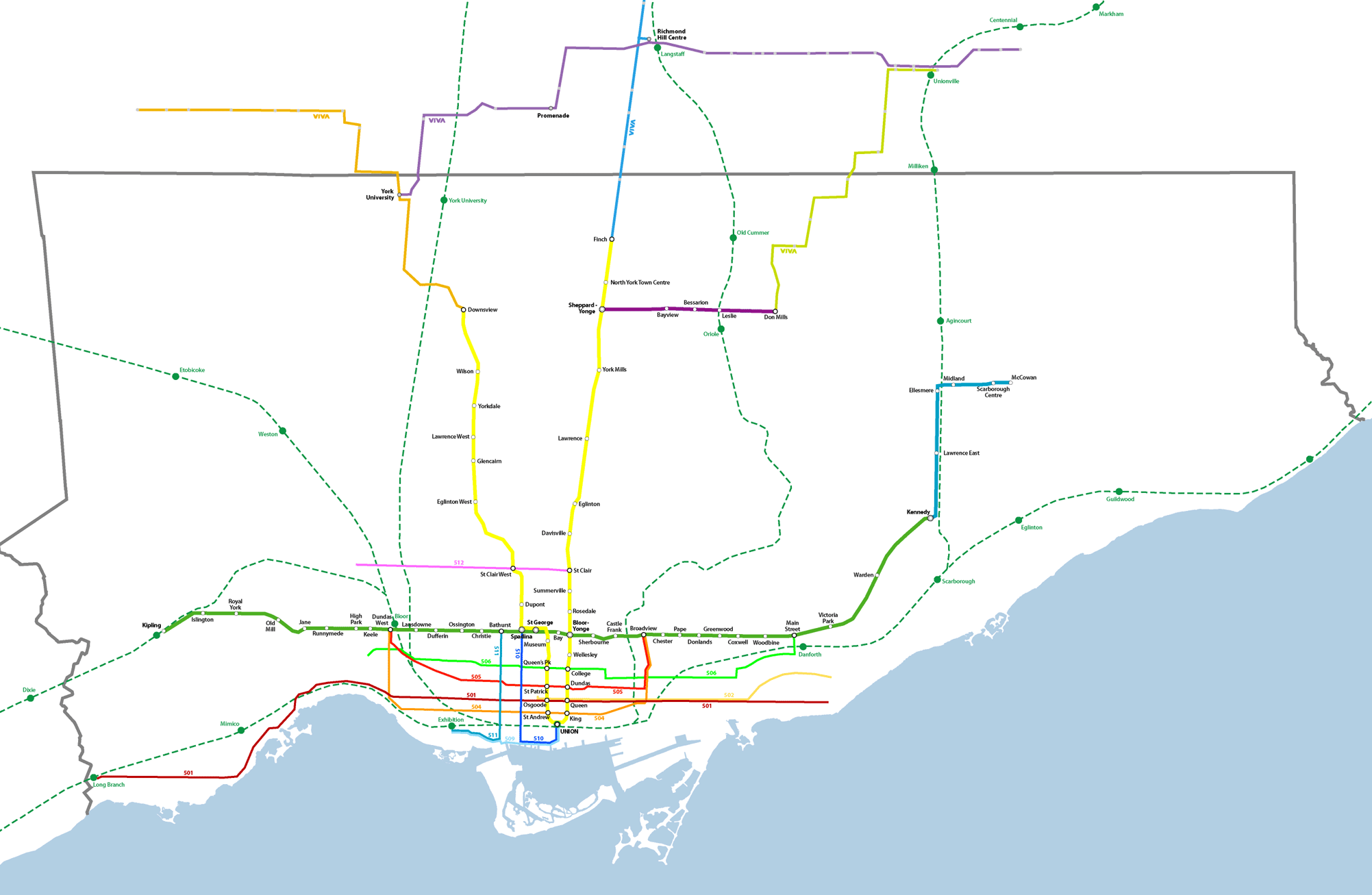
Toronto Transit Map Reimagined
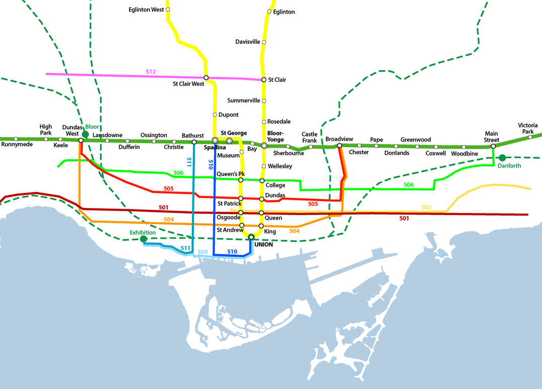
Somewhere someone was asking for someone to come up with a reimagined transit map for Toronto (could it have been Reading Toronto here?), so I thought I’d give it a shot. The one Graeme Stewart posted at Reading Toronto is interesting but I find it too schematic-looking. At the GTA level, scale is grossly distorted, but on the downtown detail map I love how he managed to integrate neighbourhood names into the map. Fantastic.
Part of his point was that more of the system should be shown than just the subway – the GO lines and the streetcars should be shown to represent more of the true nature of the “system” and I think I support his idea. However there are certain caveats and problems:
- Apart from supposed “dedicated right-of-way” LRT streetcar lines (such as Spadina’s 510 line and the Queen’s Quay lines and the western portion of the Queen 501 route along the Queensway), streetcar lines in Toronto are having serious problems moving swiftly through the city. One hears complaints of people being able to walk faster than the Queen cars move through traffic. Even the dedicated right-of-way lines have issues – a report I read indicated that the Spadina car on average is slower at getting its passengers down to Queen than the old pre-1997 buses were – I also have friends who live out near Mimico for whom in most cases taking the subway and getting a bus is quicker than the 501 car. This does beg the question of whether they should be included when some frequent service time-efficient bus routes are not.
- On Stewart’s GTA map (here), GO Transit’s rail network is given heavy prominence next to the subway lines. Indeed on GO’s own system map, their train network is given heavy coloured-line subway-like prominence, with the bus network as more generic thinner green lines. I flirted with this idea, but for now have settled for a more toned-back approach to the GO network for the simple reason that until higher frequencies are achieved and more serious urban centre-type development occurs around GO stations, the system currently bears little resemblance (in reality) to an LRT, BRT (Bus Rapid Transit), or subway system since it is heavily skewed towards commuter traffic alone.
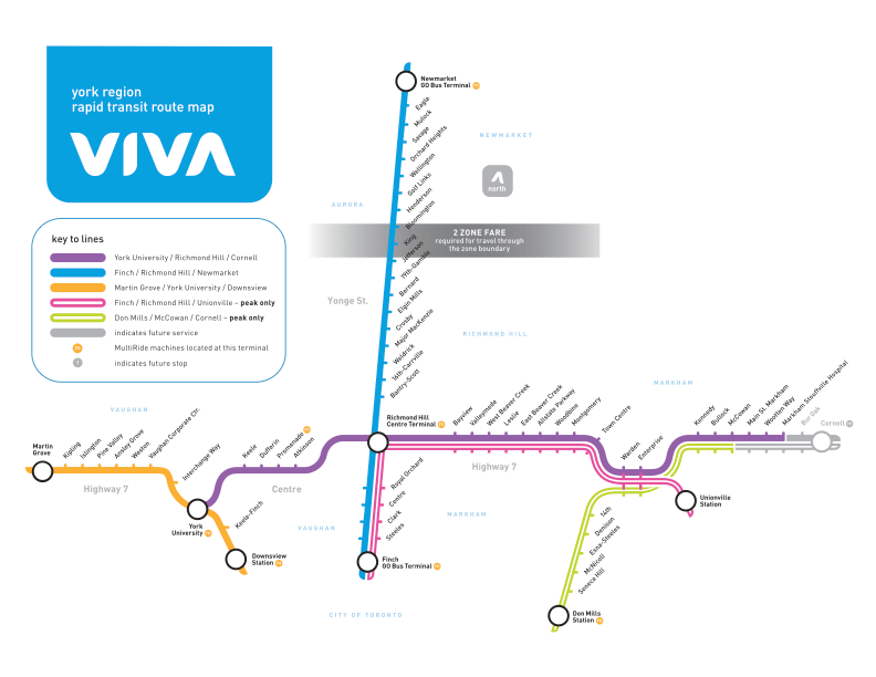
- VIVA is here – York Region’s BRT transit offering is up-and-running (for a year now), and should be given heavier priority at the regional scale. I dream of a day when an integrated fare-structure allows simple and straightforward use of all these systems together with full transfer privileges and no complications – perhaps trying to envision what the system even looks like as a whole is the first step? For now I have only shown full-service routes of VIVA, not peak-only. I don’t actually even know whether any of the other GTA municipalities have BRT-equivalent frequent-service routes to add – if they have, I haven’t heard of them.
I am also working on a full GTA level map showing all GO lines to their ends. All of these maps are real-scale without distortions in space – the disadvantages are that at smaller sizes, things become harder to read and distinguish. It could be that after I’ve done these, then a simpler diagram version could be done that distorted distance as most existing transit maps do.
Style – I’ve tried to stick to the current TTC diagram style. Why? I kind of like it. I am from Toronto though. Others, such as Miguel Syyap’s quite wonderful TTC maps, have used London Underground’s famous style – which I must say looks good too! For some reason Syyap hasn’t shown an as-is system map using his style though. VIVA has adopted this same style for their diagrammatic system maps.
Here’s links to higher resolution versions of my map:
Toronto Transit Map – downtown detail
Let me know what you think – any suggestions?
Also see our evolution of the TTC subway animated map from September 2007.

