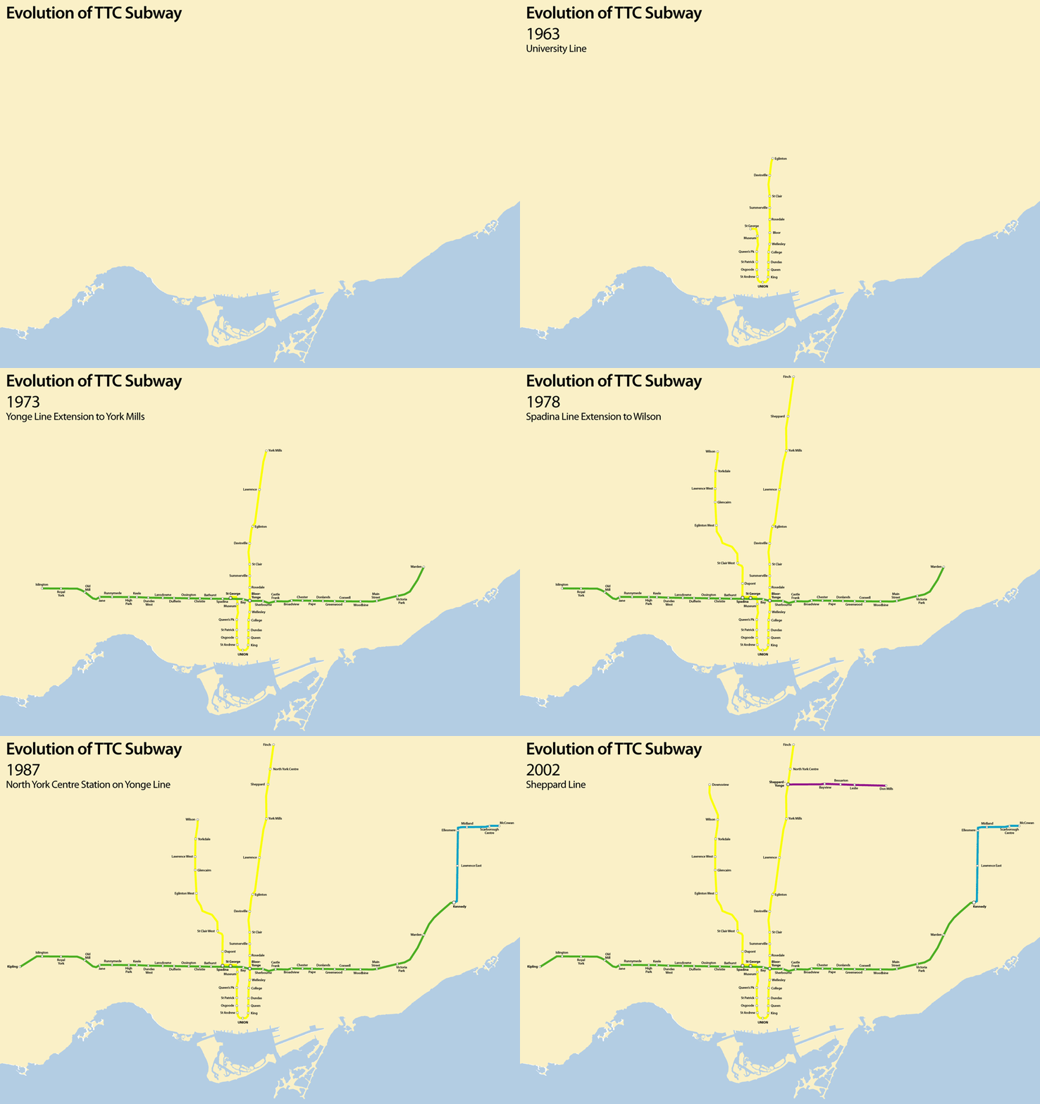
Growth of Toronto’s Subway
We prepared this map of the evolution of the TTC subway system in response to a challenge over at spacingtoronto – while this version didn’t get shortlisted as a finalist, check out the great maps that did.
One thing I prefer in our map is that the subway lines are shown true to scale, so you can compare the real lengths that have been added over time and gauge how much of the city was being covered by each phase.
Check out a larger version of our map, where you can make out station names.
Also see our reimagining of the TTC transit map from October 2006.


1 Comment so far
Leave a comment
[…] see our evolution of the TTC subway animated map from September […]
By Bricoleurbanism » Toronto Transit Map Reimagined on 07.20.10 10:00 pm
Leave a comment
Line and paragraph breaks automatic, e-mail address never displayed, HTML allowed:
<a href="" title=""> <abbr title=""> <acronym title=""> <b> <blockquote cite=""> <cite> <code> <del datetime=""> <em> <i> <q cite=""> <s> <strike> <strong>