urbanism – landscape – ideas – theory – whimsy

Day in the Life of a Market Square in Thailand

DSCF2246-scan

I was scrummaging around my hard drive and came across some scans I had done of film prints of Cambodia and Thailand from January 2004 but hadn’t cleaned up and catalogued. My digital camera had broken while at the Angkor temples in Cambodia but luckily I had my mini film camera as backup. While relaxing for a couple of days in the small Thai town of Trat near the Cambodian border (to recover from the intensity of Cambodia and the gruelling road trips in and out), I managed to get some shots of the amazing transformations of the town’s market square through the course of a day.

In the morning there’s a fairly intense wet market (for fruit, vegetables and meat), with temporary stalls with all kinds of umbrellas and canopies for protection from sun and rain. Later in the day, the wet market closes and disappears and the market square gets cleaned up and sits there empty. Then in late afternoon, the night market starts to set up with food stalls with patio furniture seating, some fruits, vegetables and dry goods. The night market runs right through the evening with a great variety of dishes available from a multitude of stalls and a fantastic outdoor eating and drinking atmosphere.

While to a casual observer it seems a bit chaotic, it’s clearly highly organized and well managed – there are even painted lines on the square surface organizing the setup. What’s most striking is how this compares to the ridiculous way some Western public squares such as Dundas Square or Nathan Phillips Square are managed, with corporate events and advertising, overbearing security, and any lively activities like what takes place in Trat every day confined to strict and infrequently programmed “events”.

DSCF2244-scan

The morning wet market of temporary stalls, Trat, Thailand

DSCF2247-scan

The morning wet market of temporary stalls viewed from above, Trat, Thailand

DSCF2252-scan

After the wet market closes, the empty market square, Trat, Thailand

DSCF2269-scan

Setting up the night market of food stalls in late afternoon, Trat, Thailand

DSCF2242-scan

Night market of food stalls in early evening, Trat, Thailand

DSCF2270-scan

Night market of food stalls after dark, Trat, Thailand

Past and Future on Shanghai’s Famous Bund

2154216483_bbc615a6ef_b-crop2-sm Source

The Bund in the 1930's

Shanghai’s waterfront is synonymous with its history. The archetypal image of Old Shanghai is a view of the city’s former front door, the storied Bund along the Huangpu River, lined with ostentatious colonial banking and commercial buildings, symbols of Shanghai’s bizarre history of foreign control and profiteering. For New Shanghai, you simply have to turn your view across the River to Pudong, where a profusion of skyscrapers have sprouted on what was docks, warehouses and fields only 15 years ago, giving Shanghai as modern a skyline as anywhere.

400_9211

Pudong Skyline from the Bund

bund-1930s-crop Source

The Bund in the 1930's

Historically, the Bund was characterized by having an old port’s chaos of ships, wharfs, docks and cargo on the water side, and the dignified solidity of the city’s prime address on the other. In the past, this waterfront vibrancy tended to be the rule rather than the exception, but Shanghai took the activity to a delightful extreme with streetcar routes and plenty of promenaders on both sides of the street. Even so, you can clearly see parallels with historic views along the Old Port in Montreal, and doubtless many other cities.

bund-from-overpass-merge-crop-eSources 1and 2

View of the Bund in 2008 showing highway off-ramp (now demolished)

380494440_44f7029803-e Source

The Bund in 2006: 10 or 11 lanes of uncrossableness, including a raised median to stop anyone crazy enough to try jaywalking - I'm not sure if the trees will be saved

Unfortunately, Shanghai’s waterfront Bund is today a pale shadow of its former self. As in so many other cities, the waterfront was eventually seen as the easiest place to put a major cross-town traffic artery – in this case, at grade, though with a large flyover (now demolished) connecting to an elevated expressway. Ten or eleven lanes of through traffic later, the waterfront promenade that is such a major tourist attraction is as separated from the famous buildings that line the Bund (and the narrow sidewalk in front of them) as possible. At-grade pedestrian crossings are essentially outlawed for the entire length of the historic area, with pedestrians forced into underground tunnels to cross to the waterfront (a temporary pedestrian overpass during construction shows how wonderful it is to see what you’re crossing). Exasperating the strange and tenuous connection between the two sides is the elevation of the waterfront promenade a few metres above street level (something that seems to have been done for flood control reasons).

400_9193-pan

View along the Bund from the temporary pedestrian overpass during construction in 2009

400_9165-crop

Before and after views of the Bund revitalization, from a poster on a street near the waterfront

Happily, changes are afoot that will be attempting to address some of the Bund’s deficiencies. Firstly, the major traffic artery is being placed in a tunnel below ground level in a huge engineering project which will leave only four lanes of traffic at grade. The Bund will be streetscaped as an urban avenue, with at-grade pedestrian crossings, trees and a much stronger connection between the two sides of the street. The raised promenade along the river will remain elevated (I presume that flood control precludes any change to that), but a series of ramps will tie it much more closely to the street and grade level of the buildings of the Bund. Clearly the proposals will be a strong step in the right direction for an urban locale that is high on the agenda for every tourist that visits Shanghai. One also hopes that reconnecting the waterfront promenade to the city this way will also encourage ordinary Shanghainese to visit more easily.

400_9166-crop

View of proposed changes of the Bund revitalization, from a poster on a street near the waterfront

Still though, it’s hard not to be a little nostalgic for the chaos, bustle and business of the old Bund. Somehow a tourist-oriented waterfront promenade choked with package tourists, silly crap for sale to tourists, and potential scams and scammers to watch out for doesn’t quite compare. Hopefully the revitalization scheme, if successful, will help to add a little more action simply by tying the promenade back to the city and encouraging a wider diversity of users. However, a view of what might have been can be glimpsed through a couple of photos found on Flickr showing the Bund in 1983 and 1984 (see below) – a beautiful tree-lined boulevard that looks like it might have compared well to the great waterfronts of the world. It’s rather funny that today Shanghai is desperately trying to get back to where it was 25 years ago when it comes to its most recognizable and impressive urban space. It’s also amusing that despite a building boom of unbelievable scale, and skyscrapers in lots of silly shapes and sizes, the waterfront that has defined the image of the city since the establishment of the international concessions continues to outclass them all.

testSource

View along the Bund in 1983

119720140_2e784bf079_o-500 Source

View along the Bund in 1984

Evolutionary Space in the Junction

August 2008 - Band shelter and (temporary?) public space

An interesting evolutionary space has been created in the Junction on a vacant lot where some retail buildings were demolished in 2007. The empty site (which was originally being advertised as a “New Retail Development Build-to-Suit Opportunity”) was rehabilitated as an outdoor stage venue (the “Junction Train Platform”) as part of the centennial celebrations commemorating 100 years since the former City of West Toronto was incorporated. The (I think temporary) space has been outfitted with some seating and temporary plant material and seems to be a pretty popular place for people to relax and have a conversation. Behind the potted evergreens at the back I think are some parking spots. It’s a great use of what was essentially a barren, desolate gap in the urban fabric! More on the City of West Toronto Centennial celebrations, West Toronto Junction Historical Society and The Junction BIA.

August 2007 - "New Retail Development Build-to-Suit Opportunity"

March 2007 - Buildings in process of being demolished

Free Wireless for the Waterfront Please

Free Wifi Zone in Montreal's Old Port

Map: Free Wifi Zone in Montreal's Old Port

I hope WaterfronToronto is paying attention – here’s a map of the free wifi zone (via sponsors) at the waterfront in Montreal’s Old Port (source). The zone was set up for and is under the jurisdiction of Les Quais du Vieux-Port (The Quays of the Old Port) – a 47.3-hectare (117-acre) territory with 2.7 kilometres of St Lawrence River waterfront – which is itself an entity created and managed by the federal agency in control of the entire Old Port, Société du Vieux-Port de Montréal (Old Port of Montreal Corporation).

Photo: Panorama of Montreal's Old Port

Photo: Panorama of Montreal's Old Port

Apparently Telus is the sponsor responsible for providing the actual wifi service, with other sponsors covering the costs. While some of us might prefer that something like Wireless Toronto (a volunteer-run not-for-profit community group dedicated to setting up free wifi hotspots around the city) were the one’s running something like this, the size of Montreal’s wifi zone would probably be too infrastructurally complicated and expensive for a small group like Wireless Toronto. Wireless Toronto have set up one of their hotspots at York Quay at Harbourfront Centre, though it’s fairly geographically limited. One of the most interesting aspects of Montreal’s zone is how the two marina areas are deliberately included allowing wifi access from moored boats! Toronto Hydro’s One Zone wireless network (which covers most of the downtown area) is not free and does not currently cover any part of the waterfront, and I think it’s the wrong model to pursue for the waterfront. I think free wifi on the waterfront would be a great way to encourage waterfront users of all kinds, and would be the kind of forward-looking optimistic project we really need to kick off the “idea” of the waterfront revitalization.

Old Port of Montreal from the air

Photo: Old Port of Montreal from the air

However, we should be a little careful when we look at the Montreal model – the Old Port area controlled by the Corporation is federal land, but being owned and operated by the Corporation actually means it is not technically public space. There are in fact a list of “site rules“, buskers and other entertainers are auditioned and require permits (as with many other tourist areas), leafletting and soliciting are not allowed, “activities may not be held or promoted on the site without permission” and “filming or photography for other than personal use must be authorized”. These are dangerous precedents for Toronto’s waterfront – while this post has mostly been about free wifi, I think the principle of freedom needs to additionally extend to the use of public space at the waterfront.

Gardiner to Come Tumbling Down… kind of

Parliament St & Waterfront Blvd

In an announcement with significant ramifications for the waterfront, the much-maligned Gardiner Expressway is to come tumbling down…. at least part of it. Waterfront Toronto, the City and the provincial Ministry of Public Infrastructure Renewal together appear to have stumbled into a momentous decision with the removal of funding for the Front St Extension and the (resulting?) decision to demolish the portion of the Gardiner from east of Jarvis to the Don Valley Parkway.

Lower Jarvis St & Waterfront Blvd

In these images released today, Waterfront Toronto gives us an idea of what the demolition of the Gardiner may mean at street level. And frankly, if this is the way it’s handled, it looks fantastic – with the added benefit (not shown in the renderings) that the railway corridor is not as wide by the time it gets to Jarvis, meaning there could be a window of hope for a relatively pleasant passage down to the lake for the East Side, all of a sudden making Waterfront Toronto’s proposed developments at West Don Lands, East Bayfront and in the future at the portlands, seem far more connected and potentially vibrant. Could this be a great day in the history of Toronto’s waterfront?

Hold your horses there…. I’m not so sure. While clearly this is a decision many of us have been gagging for for years (nay, decades!), in typical Toronto fashion are we bollocking up one of the most important decisions in the city’s planning history? While the renderings show a relatively tamed boulevard at grade (along the lines of University Avenue perhaps), the plan almost seems a slap in the face to the functionality of the Don Valley Parkway and the Gardiner combined. Now in a way it’s great that expressway functionality is not determining the decision making here, but this decision has huge ramifications on two very important roads that currently connect and essentially function as one road. While many will say “who cares”, what exactly are the expected traffic volumes on this at-grade road and how tamed and crossable will this really make it? I mean if it’s essentially a Gardiner at grade with a pedestrian signal every 5 minutes, I’m not so sure this is a good thing.

But apart from that, the mind-boggling, ridiculous, tear-you-hair-out frustration of this scheme is that if you’re making such a mess of the Gardiner and its “flow”, doesn’t it just make sense to demolish the whole damn thing while you’re at it (at least make it part of the plan to do so!)? Why on earth should the Gardiner remain above grade as it crosses the foot of Yonge Street, the most important damn street in the City and the Province, and come down at Jarvis? If you’re screwing up the Gardiner anyway, and the projected volumes are nice enough to cross at grade, then bring the whole damn thing to grade out at Strachan and open up Fort York to the lake, give City Place a chance to be an actual place, and dish out the benefits to the whole central waterfront while you’re at it.

But no. Just like Toronto to do something like this half-assed and (surprise, surprise) solely for the benefit of Waterfront Toronto’s proposed developments alone. Message delivered: central waterfront, go f**k yourself!

Area to be demolished

Bricoleur’s Habitat

redneckmansion2_500x334e.jpg

A friend sent a link to this photo entitled “Redneck Mansion”. There’s a certain genius to the way this has been done (and the colours are fantastic) – it could almost be a Bricoleur’s version of Moshe Safdie’s Habitat in Montreal (and would cost a hell of a lot less). The staircases are even reminiscent of Montreal’s exterior walkup duplexes/triplexes/multiplexes.

habitat-67-e.jpg

montreal-staircases.jpg

——————

Edit:

Unfortunately (I might say), it turns out that the intriguing caravan-sculpture masterpiece is an Amsterdam theatre set from 2005 designed by Catherina Scholten for a production of Checkov’s Ivanov. What a great idea for a theatre set! I say unfortunately because part of me dearly wished that some inspired bricoleur out there had actually dreamed up and executed such a wonderful habitat – alas no!

Here you can see some of the audience:

Photo: HetGelaat

The original photo posted was by Elmer Kroese.

Thanks to Space & Culture for linking to adaptivereuse.net‘s discovery of the true origin of the photo and work.

Mapping Our Urbanism Part VI – Income

toronto-3cities_2.gif

This animated map showcases the datum bookends of the excellent publication The Three Cities within Toronto: Income polarization among Toronto’s neighbourhoods, 1970–2000 by David Hulchanski from UofT‘s Centre for Urban and Community Studies (downloadable from their website). Income levels are shown as census tract averages as relative to the average for the Toronto CMA – the light pink is middle income (20% below to 20% above average), with the most interesting change occurring between that and the darker pink representing low income areas (20% to 40% below average).

The geographic explosion of lower incomes into the inner suburbs of north Etobicoke and Scarborough is almost stunning, but I think reflects a lot of our current received wisdom about the changes taking place in Toronto, in particular gentrification in old inner city neighbourhoods and the consolidation and bulwarking of high income areas. In short, it speaks volumes about housing affordability in the currently valued neighbourhoods of the city, and indicates that those who can afford to are abandoning many of the inner suburbs.

toronto-3cities_orig-sm-e.jpg

The more famous map from “The Three Cities” report is this one (above), which highlights those areas with the biggest increases (blue hatch) and decreases (dark brown) in average income between 1970 and 2000 – in this case, white areas are considered relatively stable. As you can see, looking at it this way clearly shows both gentrification at work and that the census tracts with the largest decreases in average income are almost all in the inner suburbs.

Hulchanski calls this a dramatic polarization and segregation of the city based on income, and firmly makes the point that we are capable of addressing this trend through better policies on housing affordability and requiring more affordable units in new developments to ensure that mixed income neighbourhoods are the norm instead of the exception: in his words “The segregation of the city by socio-economic status need not continue. It can be slowed and reversed.”

Crossposted to spacing toronto as part VI of a series – to view the five earlier parts follow these links:

Mapping our urbanism Part V – watersheds

Mapping our urbanism part IV – language

Mapping our urbanism part III – water mains

Mapping our urbanism part II – extents

Mapping our urbanism part I – snow ploughing

Sugar Beach for Jarvis Slip – a Defense

The Star’s Christopher Hume today wrote a scathing attack on Waterfront Toronto’s jury of “insiders” for its choice of Sugar Beach as winner of the Jarvis Slip Public Space Innovative Design Competition (see images from the 3 designs in our previous post).

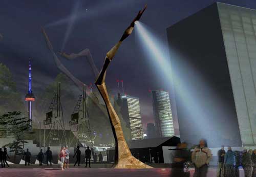
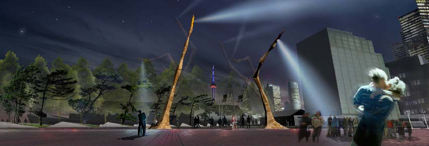
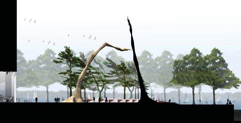
Hume suggests that we were in fact making a choice between a couple of giant movable arms and a giant screen wind scuplture, but has the gall to say that architect Siamak Hariri may create admirable buildings but “has never shown any special understanding of the landscape”. Sorry Mr. Hume, reducing a landscape architectural public space project in a waterfront location to a choice between two sculptures (however animate) doesn’t show much special understanding of the landscape on your part either. The two features of the design proposals that seemed to attract the most attention both existed essentially in a vacuum disconnected from the site or its context, having no sensible relationship to the surrounding landscape, nor any spatial qualities that would add to the spatial experience of Jarvis Slip.

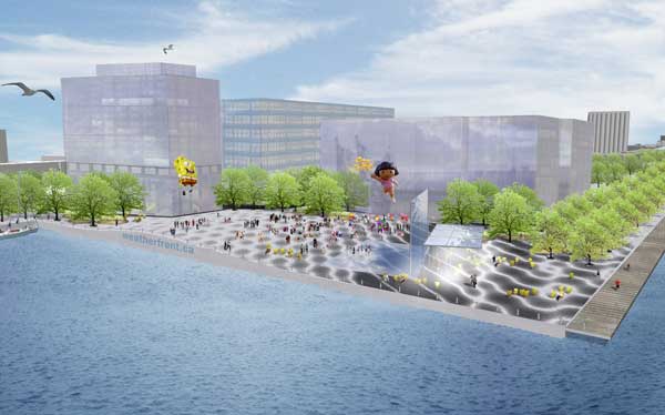
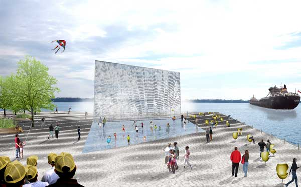
Yes, the wind sculpture by Ned Kahn would be fantastic, but what is the compelling reason for it to be in this location, and how is it remotely site-specific if it’s essentially similar to all of Kahn’s other wind sculptures? In fact, the Weatherfront team went out of its way to fuss about how we get our weather from Pearson International instead of the waterfront, but since weather stations are traditionally located at airports, the best place for this Ned Kahn sculpture would in fact be directly across from the island airport, not at Jarvis Slip. Not to mention the perversity of placing a screen of this kind across the line-of-sight of the best view from Jarvis Slip (across to the islands), or the fact that the ripples, waves and motion of water in a bay as large as Toronto’s harbour is nearly as endlessly interesting, fluid and dynamic as Kahn’s sculpture would have been, so again, why here? In fact, such a sculpture would be awesome covering one of the buildings facing Dundas Square, not here where the natural glories of Toronto’s harbour are on full display for all to see.

Hume does have a point in his skewering of the machinations of the jury in choosing Sugar Beach while proposing 14 modifications to the design including creating the beach somewhere else instead.

If you set up an “Innovative Design Competition” and then choose what was perhaps the least innovative of the entries, there is something to answer for, but in this case, maybe we should question the use of a competition such as this for this site, and the criteria for innovation we were really after – that is, innovation in public space, not in public art. The innovations in the West8/DTAH and Weatherfront designs were both essentially sculptural, while the overall designs for both were uninspiring and even adversarial to their context.

I am reprinting below the defense of Sugar Beach I posted as a comment over at Spacing Toronto:

———————–

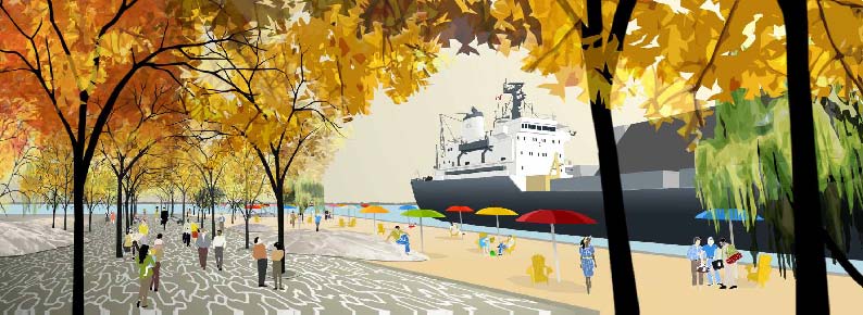
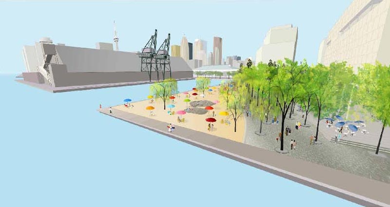
I agree with the choice of Sugar Beach for several reasons (to the chagrin of friends at DTAH who think I have a conflict of interest, though I had nothing to do with the design). I think it’s true that it may take some selling for the idea of a beach in this location to be given credibility, but personally I think the juxtaposition of industrial and recreation uses could be exciting and interesting.

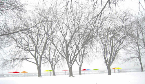
As to the year-round use, it hardly feels like the site would be a place for people to naturally convene in winter anyways – how much effort should be expended on attracting people in winter to exposed west-facing sites bound to be windswept and cold? The location of the site next to the potentially inanimate private use of the Corus building hardly bills it as the Dundas Square of the waterfront.

I think if you only ask 3 teams for submissions (all of whom have already done work along the waterfront) you’re really handicapping the possibilities of the location – in this case, as exciting and attention-grabbing as the West8/DTAH scheme was, it failed to really evoke or respond to the specific place of Jarvis Slip and, without the gimmick of the arms, didn’t have a leg to stand on…

I think there’s a little bit of genius simply to the name “Sugar Beach” – I can imagine years from now, with the Redpath plant long gone, the subtle evocation of the relationship carrying on in the identity of this place – “meet me at Sugar Beach” sounds so much better than “meet me at those big arms that stopped working years ago down by the waterfront”. While the name HtO was clever but gimmicky. I feel it will eventually fade as a name through lack of use, Sugar Beach as a name seems like it will have lasting power and be able to become part of the physical and psychological landscape of the city.

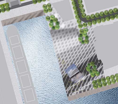
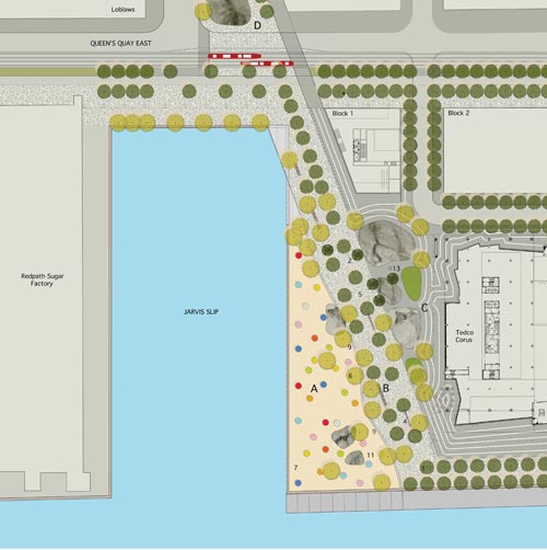
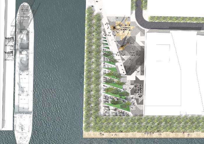
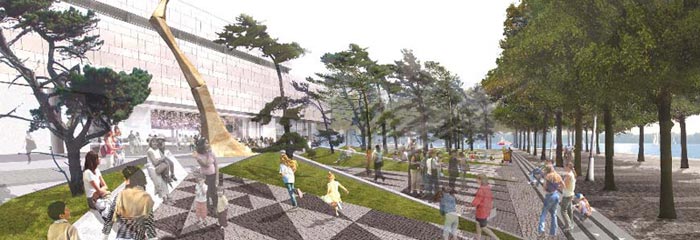
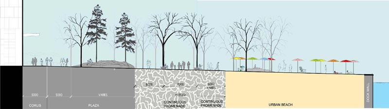
Beyond the name, the design for the Sugar Beach scheme itself was well-thought out – not too complicated or cluttered, and just seemed to be a natural extension of the city and waterfront. In particular, the use of the angled waterfront promenade continuing the line of sight from Jarvis from the original East Bayfront Precinct Plan seems highly appropriate in guiding most pedestrian/active through-traffic in a direct desire-line to continue along the east bayfront, while the more passive use of the beach wedges in on the water side of the promenade.

While some people seemed against the use of rock-mounds (maybe it depends on whether or not you like the Cumberland Park version…) I think the way that they’ve been used in the Sugar Beach scheme is appropriate and a more subtle evocation of the canadian landscape than the West8/DTAH version which seemed to be trying too hard to be canadian. The rocks coming out of the sand of the beach seems like a great idea too, while larger rocks in front of the face of the Corus building seems like a good response to the future private nature of that building.

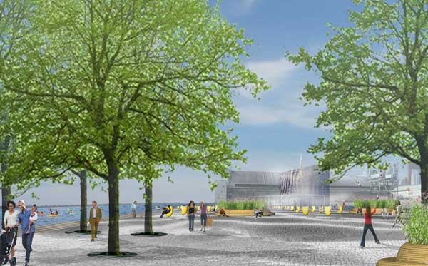
I think Sugar Beach will be a great place, appropriate to where it is, and with the potential to be an interesting hiatus on a walk along the waterfront. I think it’s worth remembering that too much glam and style in landscape architecture rarely tends to be long-lasting, but is too easily convincing in renderings and models. Old parks maintain their charm because they’re timeless, not because they were gimmicky. While certain key, central locations can more than withstand a glam and style design, Jarvis Slip is not this location, because people have no reason to be here – given that reality, Sugar Beach wins out…

I think in the end, Sugar Beach can be said to be representing the establishment and extension of something of a “style” for Toronto’s waterfront, a style that seems built on something that has come out of this city (regardless of Cormier being from Montreal). Something in the essence of Toronto got expressed in the success of HtO – but some people seem hell-bent to turn Toronto into something “else” – no doubt they also think the ROM and AGO renovations actually have something to do with Toronto instead of just happen to be here. It seems like the ultimate test of whether you love Toronto, as it is, with its quirks, foibles, frustrations, and just want it to get better, or whether deep down, you just want Toronto to be somewhere else – Chicago perhaps, or New York, Vancouver, Montreal, London – it’s always somewhere else that’s stylish, that’s good, that has taste, that has innovation – the grass is always greener somewhere else.

But from my point of view, Sugar Beach will only add to the greenness of the grass in our garden down by the waterfront. We should stop pissing all over Waterfront Toronto – the establishment of the urban design review process implies that the members of the panel are knowingly guiding development and public space towards the greater goals in the public interest that have been established by Waterfront Toronto’s planning work – even when that means they have to override the whims of individual designers (and, god forbid, newspaper columnists). In this case, the only true test will be in what gets built, and how well it works. Until then, we need to have a little faith. All is not lost. Sugar Beach will be a great place.

Urban Fabric & Form Comparison

urban form comparison

The Star today published a cover story (Beyond Density) in their Condos section on the efforts in Mississauga to create a more vibrant and pedestrian-friendly downtown – key among the problems identified has been the large scale of the block patterns in Mississauga – to prove the point the article includes urban form/fabric drawings of 9 cities (one hopes at the same scales) in order to compare the scales of the fabric of the street network. I include the drawings below alphabetically (with Mississauga first).

(edit: a friend requested I lay out all the drawings in a grid for easier comparison – I hope you enjoy – click on the above image for a larger version)

More than anything, the comparisons expose the inherent problems of scale in trying to evolve any suburban, auto-oriented area into a more pedestrian-oriented centre. The traditional response in suburbia has been to internalize pedestrian areas (in the form of the mall), Square One (home to the largest Walmart in the world) being a particularly powerful example, though Scarborough Town Centre might be the more classic one. The size of Square One’s block makes a very interesting comparison with Copenhagen’s city centre (3rd below) in which a series of streets and spaces have been linked together and pedestrianized (view a map of the pedestrian areas of Copenhagen from Metropolis magazine). In size or length of pedestrian space, the two might even be close, but in overall character and degree of integration into the urban fabric (particularly important for pedestrians) they are from wholly different worlds and you can easily trace much of these differences to the scale of the street fabric.

The other striking lesson from such comparisons is that there really is no perfect form of street fabric – many different networks and patterns are capable of producing wonderful places and being friendly for pedestrians as long as their fabric allows frequent and comprehensive linkages – there simply seems to be an upper scale beyond which all hope of efficient (and therefore popular) pedestrian circulation is gone.


MISSISSAUGA: “Long blocks and virtually empty sidewalks”

Barcelona Urban Fabric
BARCELONA: “La Ramblas is the main north-south promenade”

Copenhagen Urban Form
COPENHAGEN: “City features a car-free zone called the Stroget”

London Urban Form
LONDON: “The Mayfair and Soho districts south of Oxford St”

New York Urban Form
NEW YORK: “Midtown Manhattan south of Central Park”

Paris Urban Form
PARIS: “Streets were designed by Georges-Eugne Haussmann”

Rome Urban Form
ROME: “East of the Tiber River bend that points to the Vatican”

San Francisco Urban Form
SAN FRANCISCO: “Market St splits the central city into two grids”

Toronto Urban Form
TORONTO: “Between Queen and College Sts east of Bathurst”

Jarvis Slip Design Submissions

west8 - dtah view

Waterfront Toronto has released the 3 competing designs for the public space at Jarvis Slip at the foot of Jarvis Street.

PDF files of the competitors’ panels and written report submissions have been made available at the Waterfront Toronto site. – but since at least one of the PDF’s is 90MB, and there’s nowhere else to just see some images from the designs, (edit: torontoist posted images on friday) I thought I’d make some available.

———————————————-

Info on the public presentation and exhibition:

Public Presentation
January 21, 2008
7:00-9:00 p.m.
Metro Hall (Rotunda)
55 John Street

Exhibition
January 21-25, 2008
Metro Hall (Rotunda)
55 John Street, Toronto

———————————————-

Weatherfront
JRALA with Charles Waldheim and Ned Kahn

jrala view1

jrala view2

jrala plan

jrala view3

———————————————-

Sugar Beach
Claude Cormier Architectes Paysagistes

Cormier view 1

cormier view 2

cormier view 3

cormier section

cormier plan

———————————————-

Jarvis Square
West 8 + DTAH

west8 - dtah view1

west8 - dtah view2

west8 - dtah view2

west8 - dtah section